Design System Creation
Design System Creation
Lights. Camera. Action: Building a Design System for Letterboxd
Roles:
Website Deconstruction, Design System Developer, Documentation Writer
Team Members:
Lillian MacGuire, Ariel Li, Krishna Kishore Lal, Hridya Nadappattel
Tools:
Figma, Figma Slides, ZeroHeight
Duration:
9 weeks
SUMMARY
Abstract
Over a 9-week team project, we examined the desktop version of Letterboxd to create a unified and scalable design system. The process began with a deconstruction phase, where we conducted a UI inventory to identify inconsistencies and recurring patterns across the interface.
Building on those insights, we focused on designing and documenting a comprehensive system. This included creating a robust UI kit in Figma and developing a documentation website to support consistency and scalability across future designs.
The project emphasized visual alignment, system-level thinking, and clear documentation, resulting in a reusable framework that improves both the user and designer experience.
BACKGROUND
Ever Heard of Letterboxd?
Letterboxd is a social platform for film lovers to log, rate, and review movies. Users can create watchlists, follow friends, and explore community-generated lists and reviews. It serves as both a personal film diary and a space for film discovery and discussion
The Problem: How Many Shades of Grey is too Many?
Upon inspection by our team, we realized that Letterboxd suffers from two key issues with its current interface:
Inconsistent Visual Styles
The interface featured an overwhelming number of styles, with multiple shades of gray and an inconsistent use of typefaces. This lack of visual cohesion made the UI feel cluttered and difficult to navigate.
Accessibility Issues
Several color combinations across the site failed to meet WCAG contrast guidelines, creating barriers for users with visual impairments.
The Solution: The Action Design System
The Action Design System was created to move the team beyond repetitive tweaks and toward designing more thoughtful, consistent interactions. By establishing a shared language with clear naming conventions, designers/developers can communicate more effectively.
We named the system Action as a tribute to filmmaking; it signals clarity, focus, and momentum.
THE UI KIT
Piecing everything together: Conducting a uI inventory
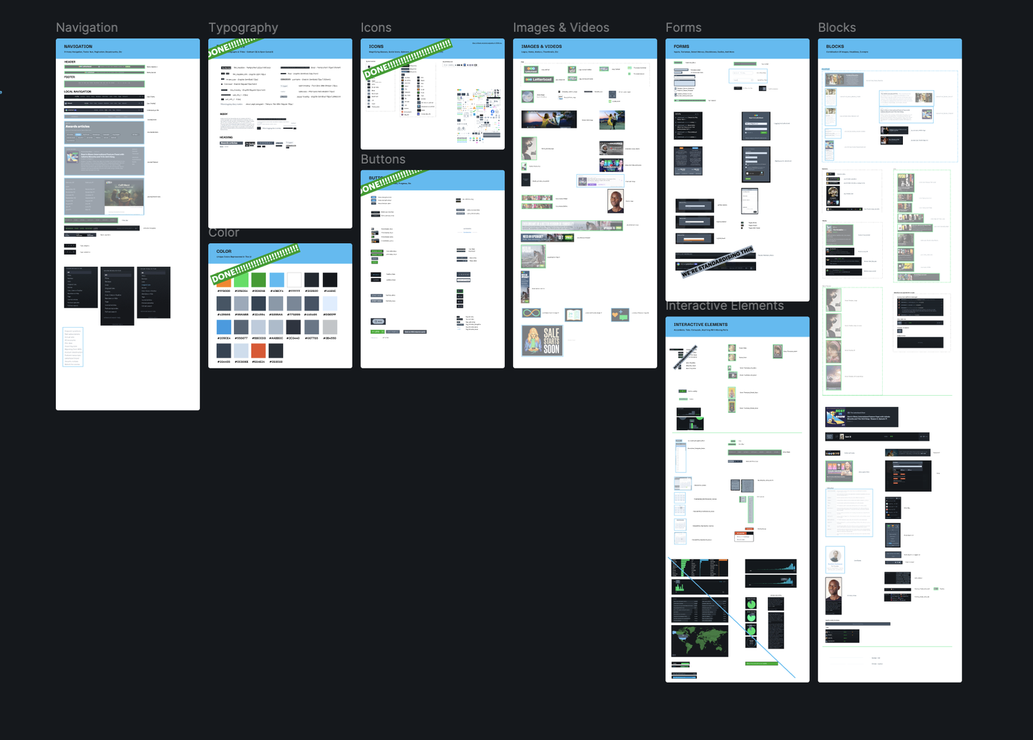
To ground the system in Letterboxd’s existing UI, we conducted an audit using Atomic Design principles:
Broke down the interface into atoms (buttons, icons, labels)
Identified patterns forming molecules and organisms (ex., search bars, review cards)
Mapped visual inconsistencies and redundancies across the site
This structure gave us a clear foundation for a scalable system based on real, existing design patterns.
From Inventory to Implementation - Turning Principles into Components
With the UI inventory complete, our system named, and principles defined, we moved into building components in our Figma UI kit.
Our goal was to create reusable, accessible elements that would streamline collaboration between designers and developers. We implemented Figma variables and design tokens to ensure consistency, scalability, and ease of use across the system.
1 - Tokenized for Consistency
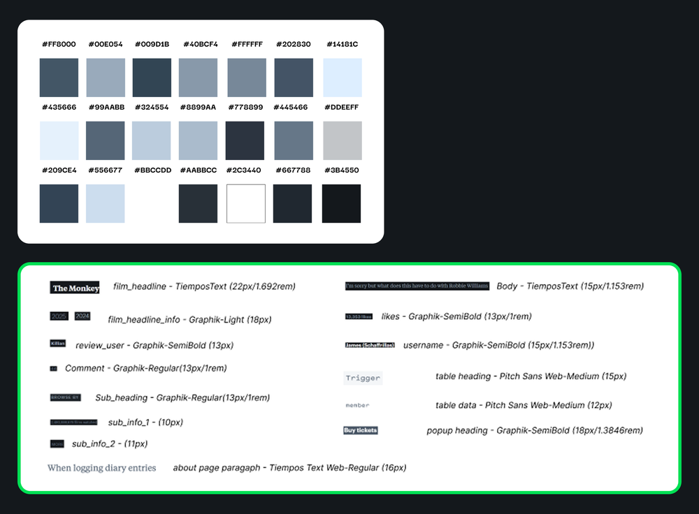
We tokenized reusable elements across three levels - core, semantic, and component - to bring structure and flexibility to our system.
This applied to foundational styles like color, spacing, and border radius, allowing us to maintain consistency while making the UI kit easier to adapt and scale across different contexts.
2 - Reusable and Scalable Components
We designed components with reusability and flexibility at their core, ensuring they could adapt to a variety of use cases across Letterboxd.
Elements like dropdowns, titles, icons, and buttons were built with configurable states and styles, allowing for easy customization without breaking consistency.
3 - Combine Components into Patterns
By combining components, we built larger patterns - like headers and cards - that bring full pages to life.
Each component was prototyped in Figma to showcase key interactions, such as logging a film as liked or watched, making the system both functional and demonstrable.
Putting the UI Kit to the Test
We tested our UI kit by asking fellow designers to recreate pages from the Letterboxd website using our components. Throughout these sessions, we documented any usability issues that surfaced.
The main point of confusion was around the different card components. Since Letterboxd utilizes multiple card formats throughout the site, we revised our designs to communicate each card’s intended purpose more clearly.
Overall, feedback on the system was very positive. Designers found it easy to use, clear, and well-structured.
DOCUMENTATION
Action, Scene Two: The Documentation Site
The second phase of our design system focused on building a documentation website, hosted on ZeroHeight. This site serves as a shared language between designers and developers.
The documentation includes our design principles, foundational styles like color and typography, and a complete component library with usage guidelines and best practices. Each element is paired with visual examples and annotations to ensure clarity.
We also included onboarding steps for new users and contribution guidelines to support future scaling and maintenance.
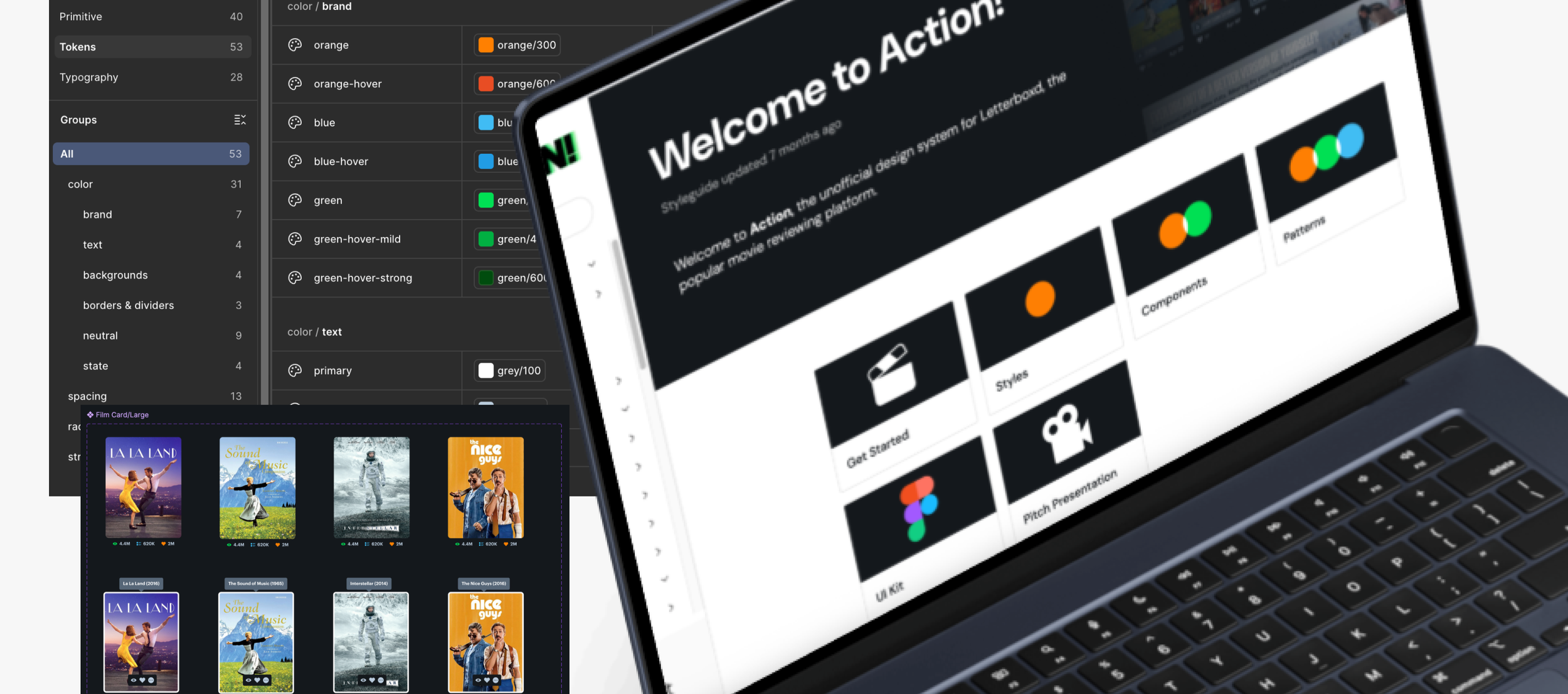
Below you will find an overview of our “Getting Started” section of Action’s documentation. We include details on how to access the UI kit, our guiding principles, accessibility resources, and more:
We also included a breakdown for how to use every component and pattern in Action. Each component has its anatomy broken down, usage guidelines, and accessibility guidelines. Please see an example of the film card component below
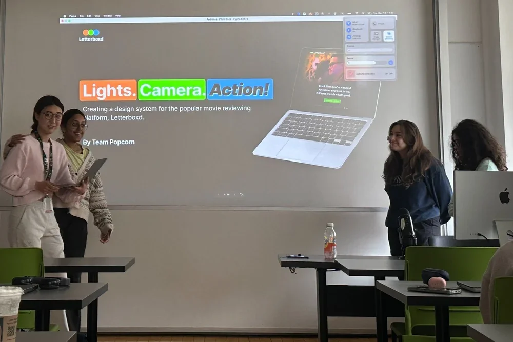
PITCHDECK & CONCLUSIONS
Why Should Letterboxd Embrace the Action Design System?
Once our UI Kit and documentation website were complete, it was time to pitch our idea. We presented our arguments for why Action should be adopted in the form of a slide presentation, highlighting the following benefits:
Designers can focus less on tweaking stuff like padding and more on designing delightful and meaningful interactions
Helps the team work faster with fewer roadblocks
Makes it easier to pitch and communicate designs thanks to consistent patterns
Gives clear names to everything, so design and development teams can reference elements with ease
Next Steps for Action
With more time, Action could continue to grow through ongoing feedback from designers and developers at Letterboxd, allowing for thoughtful improvements based on real-world use.
Additionally, expanding the UI kit with more patterns would further streamline the design process and support a wider range of use cases.
Reflections & Takeaways
I had a limited level of experience with design systems usage and development before this project. I learned so much, especially when it came to using advanced features in Figma! Some of my takeaways are as follows:
Learned the value of design systems for collaboration between teams: Creating shared tokens for color, spacing, and typography helped establish a clear connection between design and development. It showed me how a well-structured system can streamline communication and reduce inconsistencies in designs.
Documentation matters: I used to think documentation was extra, now I see it as essential. A clear, centralized source of truth makes the system easier to use, reference, and build on.
Design systems are always meant to grow: This project reminded me that a design system isn’t a one-time delivery. It should be flexible, open to feedback, and evolve alongside the product and team's needs.