App Concept + Design Creation
App Concept + Design Creation
EchoStream: Fostering Social Connection Through Shared Interests
Roles:
Account Manager, UX Designer, UX Researcher, Strategist
Team Members:
Lillian MacGuire, Rohan Boda, Manjot Kaur, Jeffrey Delacruz
Tools:
Figma, FigJam, Figma Slides, Zoom
Duration:
14 Weeks
SUMMARY
Abstract
For this project, my partner and I were tasked with the following challenge:
"Your client wants you to help design the vision and key flows of a digital experience that helps people build a habit or make a behavior change."
We chose to explore how social habits are formed and how certain behavior changes can strengthen interpersonal relationships. This led us to create Echostream - a media-sharing platform that lets users see, react to, and message friends about their streaming activity. Our goal was to make staying connected easier, especially for those with busy lives, ultimately fostering stronger and more meaningful relationships.
Our research findings and final designs were presented in class as a formal presentation.
INITIAL RESEARCH
exploring the habit tracking app ecosystem
To generate potential app ideas, we started by exploring the existing landscape of habit and goal-completion apps. Our goal was to answer key questions that would guide our direction:
What compelling approaches are other apps taking?
Where do gaps or opportunities exist for improving the experience?
How might our app fit into this landscape?
To deepen our understanding, we analyzed five direct competitors whose apps explicitly focus on habit-building activities.
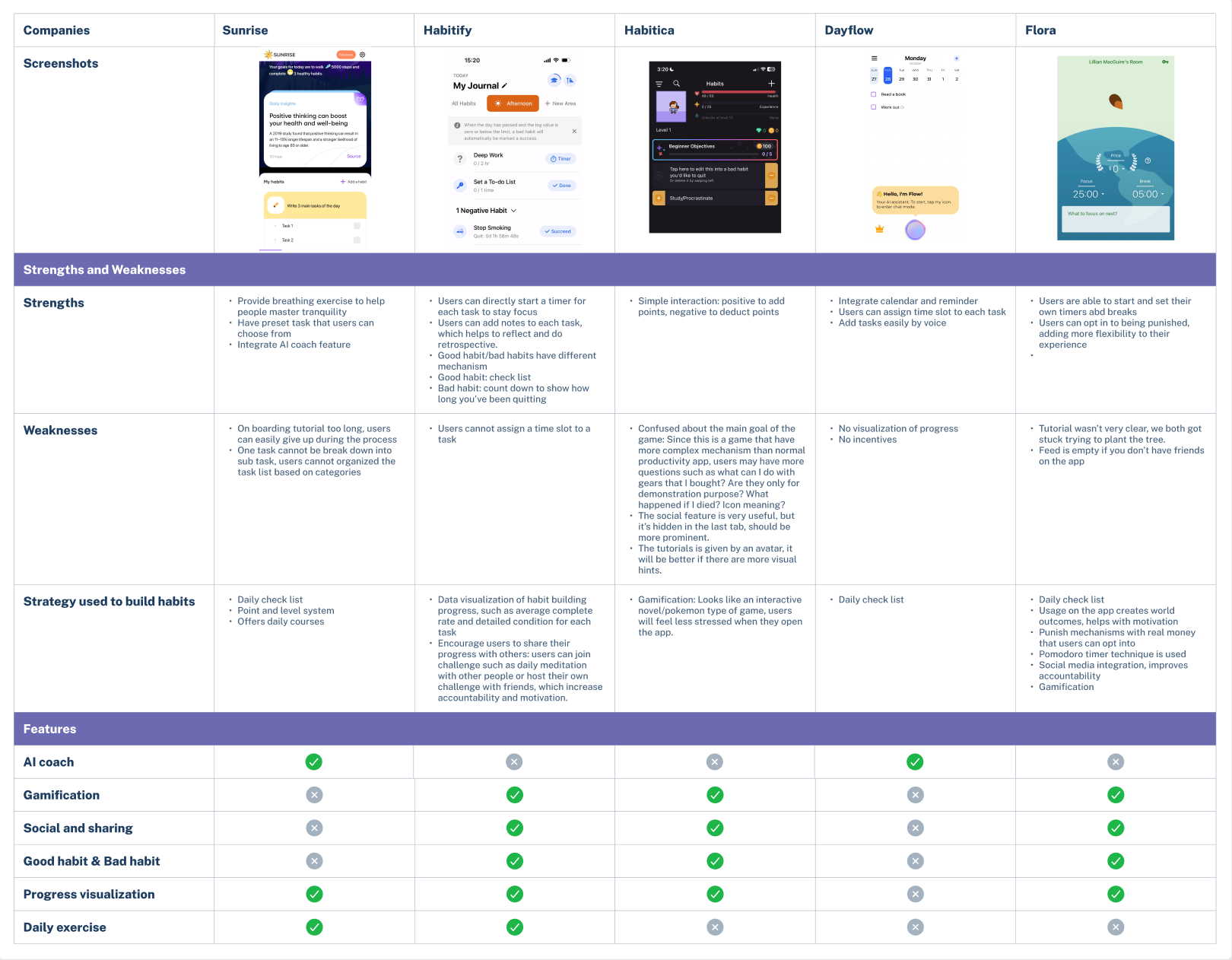
Habit tracking apps felt too surface level, so we dove deeper
After completing the landscape analysis, we were left unsure whether or not a habit-tracking-oriented app would be the best way to promote stronger and more meaningful relationships.
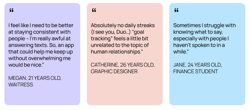
We decided to zoom out and interview potential users/conduct diary studies for more information on how they find and maintain connections with loved ones. The following are highlight quotes:
exploring apps that users visit daily, but focus less on habit formation
After our Interviews and diary studies, it was clear we missed the mark on how users like to connect with those in their life. Users prefer apps that offer:
Convenient opportunities for connection
Natural conversation starters
Easy to use without being overwhelming
So, using our newfound insights, we looked for apps that achieve these wants well for their user base:
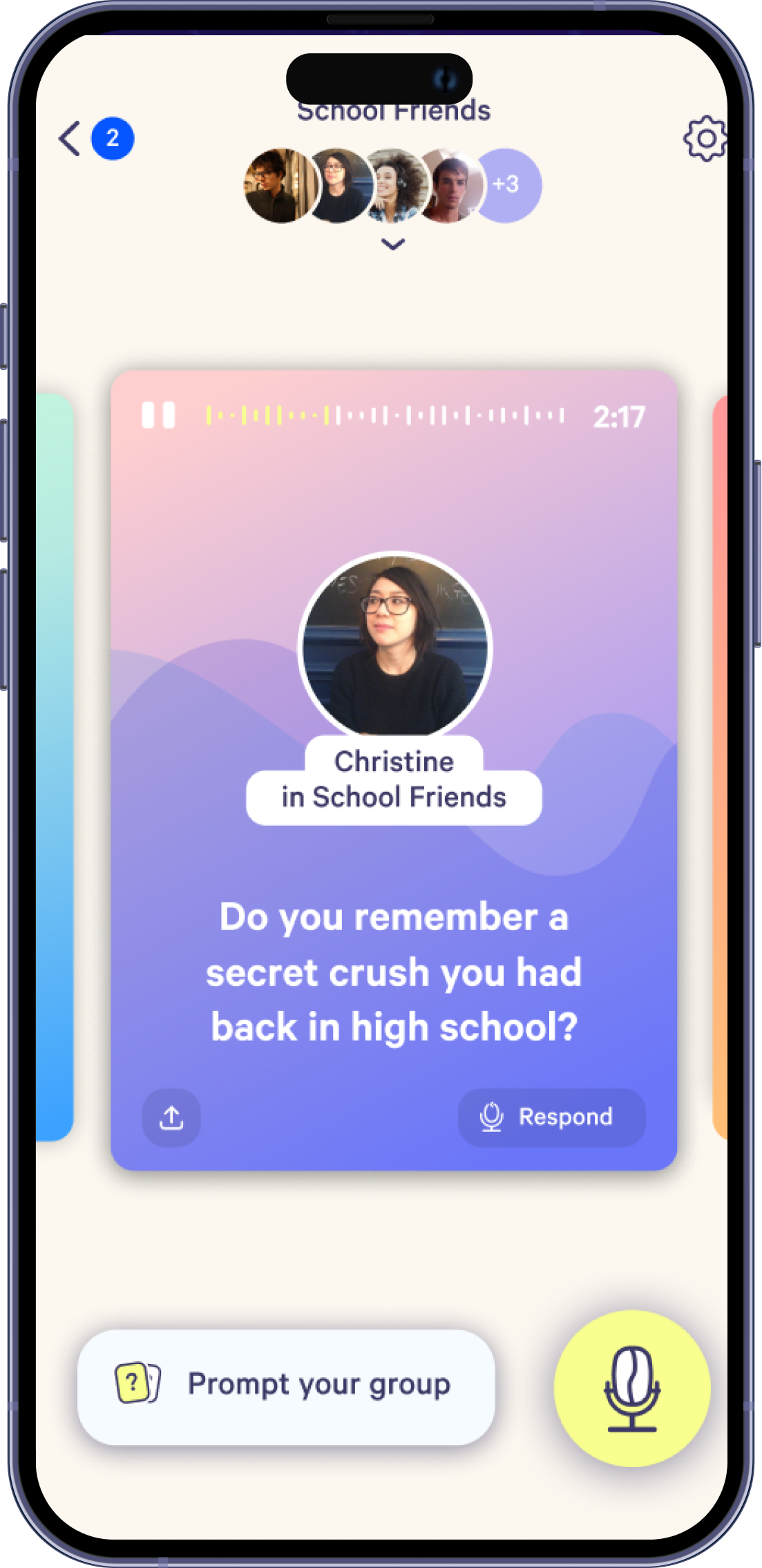
Cappuccino
A mini-podcast app made up of stories. You and your friends record short audio stories (“beans”) throughout the day.
Airbuds
A widget for best friends to share their listening activity. You and your friends can see what each other is listening to.
WeChat
A multifunctional Chinese app that combines messaging, social media, and mobile payment features, serving as an all-in-one digital platform.
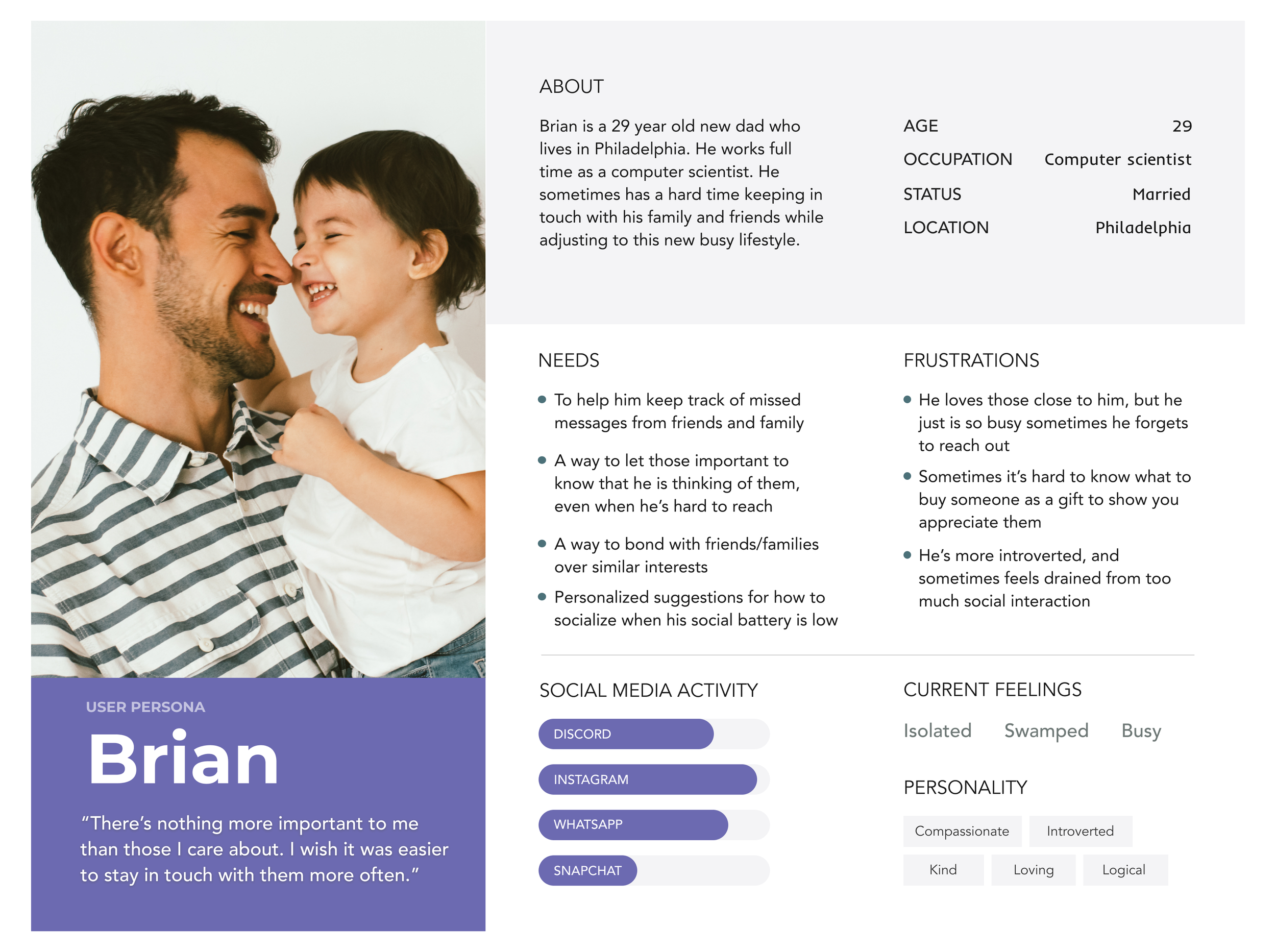
Creating a persona to visualize our users
After understanding our audience's needs, we created a user persona to better empathize with them. Meet Brian! He has the following problem:
"Between juggling my job and adjusting to life as a new parent, keeping up with my friends and family feels overwhelming. It’s easy for me to feel quite lonely.”
Brian wishes there were an easier way to stay connected and in the loop with what they’re up to.
APP CONCEPT + DESIGN FORMATION
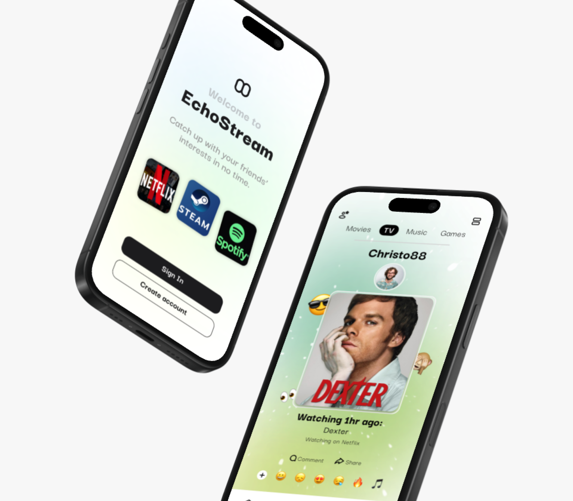
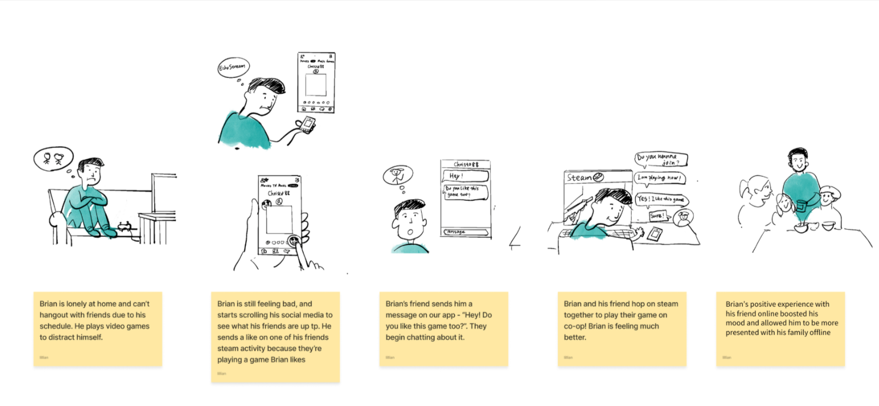
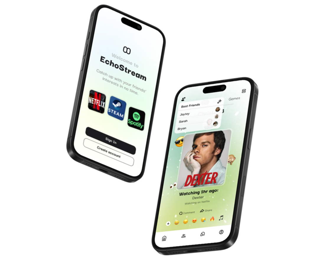
The Concept: Echostream
Brian wishes there were an easier way to stay connected and informed about what they’re up to.
To avoid feeling lonely, we came up with the app following the app concept.
Imagine an app that lets users link their gaming, entertainment, and music streaming platforms to track and automatically post their activity to their page. Where users can add friends on the app and react to their streaming activity with emojis or send messages to their friends.
We named his concept EchoStream, as it allows you to echo your streaming activity to your friends. Here’s what it looks like when Brian uses EchoStream:
Building an app architecture that encourages social interaction
Once we had a solid understanding of EchoStream’s goals, audience, and user needs, we proceeded to structure the app. Our competitive analysis played a key role in shaping an experience that felt intuitive and familiar.
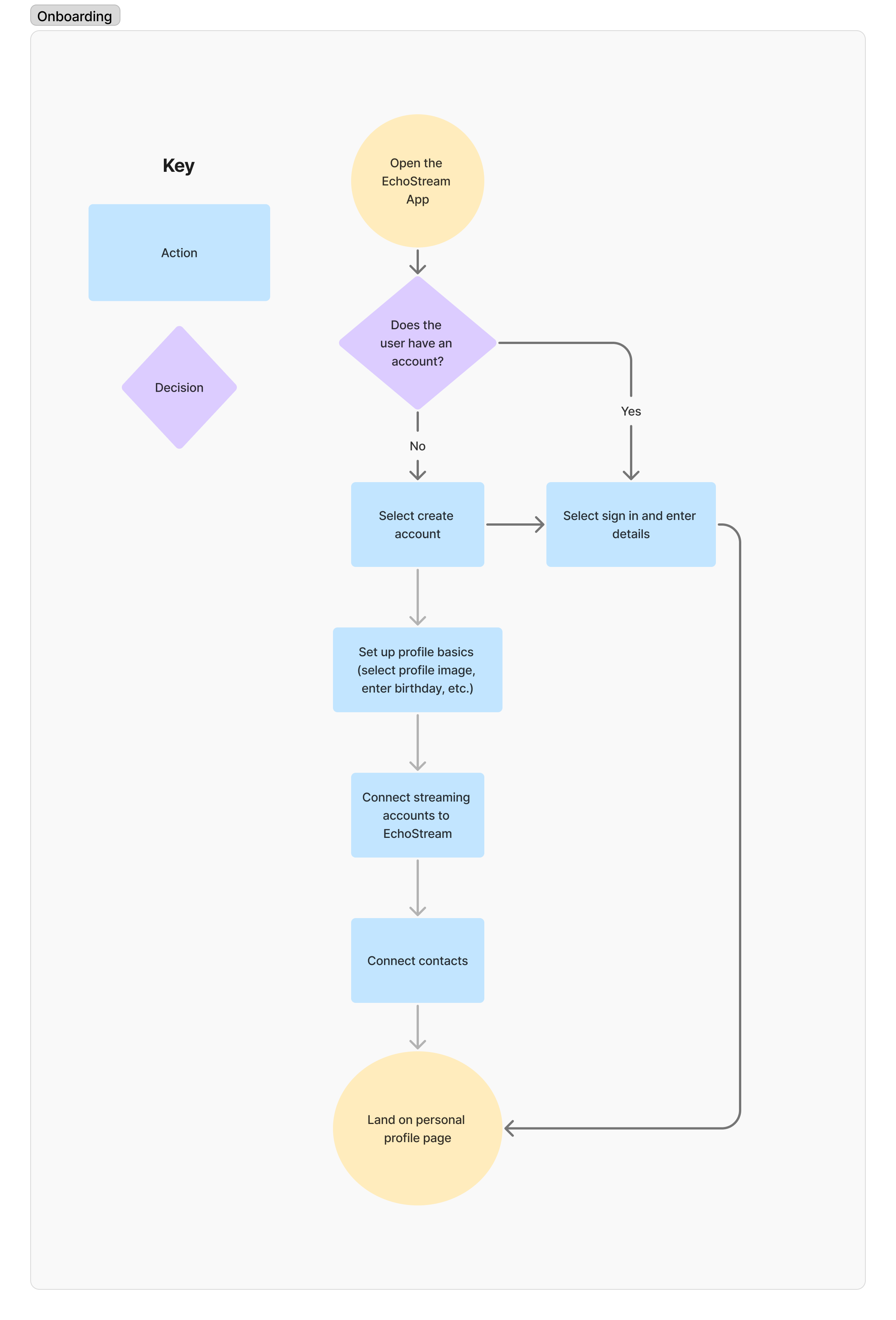
We started with onboarding, where users create a profile and link their preferred streaming accounts. After onboarding, they can navigate through:
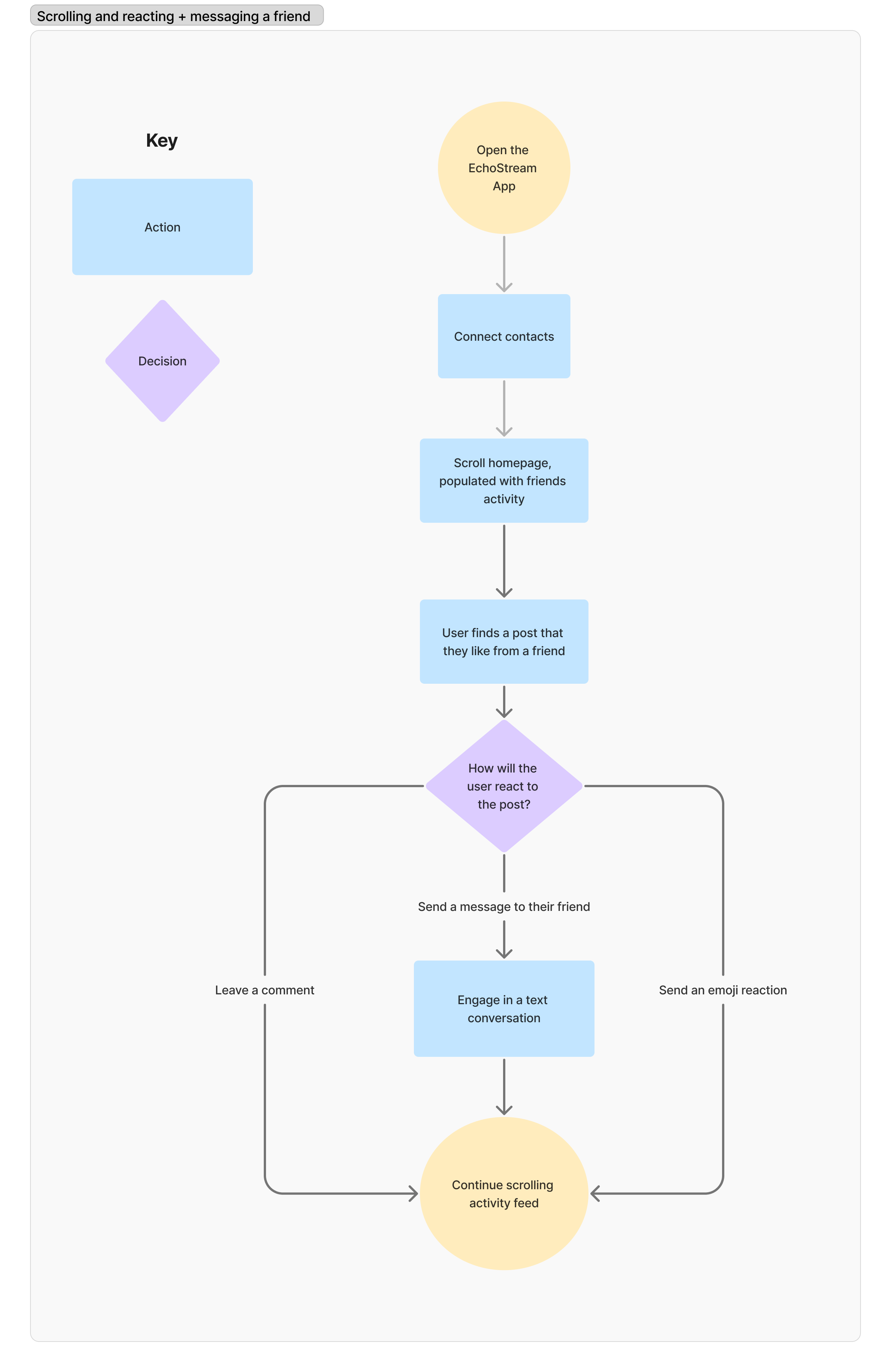
Activity Feed – See what friends are streaming.
Profile Page – Recap personal activity, post statuses, and add favorite media.
Friends List – Link contacts, invite friends, and view profiles.
Messaging – Send direct messages and create group chats.
With this framework in place, we began drafting flows to understand what steps the users would take through the app. The following are two example flows we created:
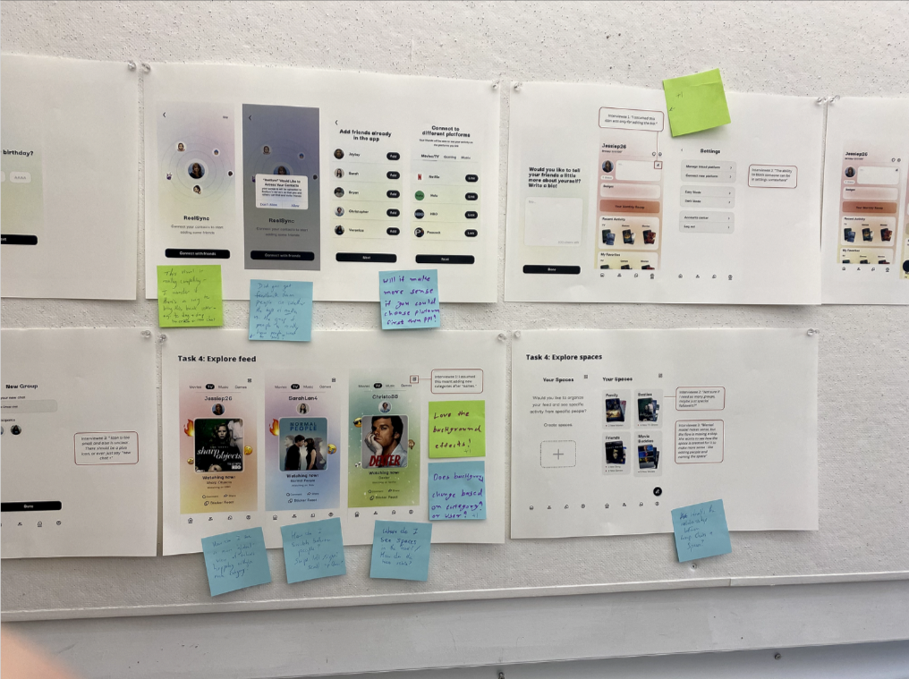
Once we had the flows in place, we could begin drafting the screens by creating wireframes. Below, you will see the wireframes that we created to visualize the look and feel of the onboarding flow:
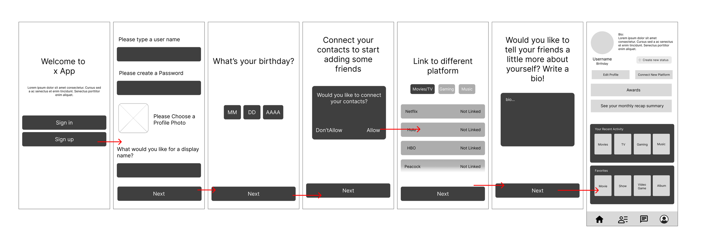
Once we had the flows in place, we could begin drafting the screens by creating wireframes. Below, you will see the wireframes that we created to visualize the look and feel of the onboarding flow:
Getting feedback from classmates and potential users
After presenting our first round of high-fidelity mockups, my partner and I received extensive feedback from our professor and classmates. During a gallery walk, classmates provided input on icons, user flows, and areas where the app’s functionality could improve.
Many classmates expressed interest in using an app like Echostream, making their feedback especially valuable as we refined our designs.
We also revisited the individuals we had interviewed earlier in our research process and conducted a brief round of testing with them.
FINAL APP PROTOTYPE
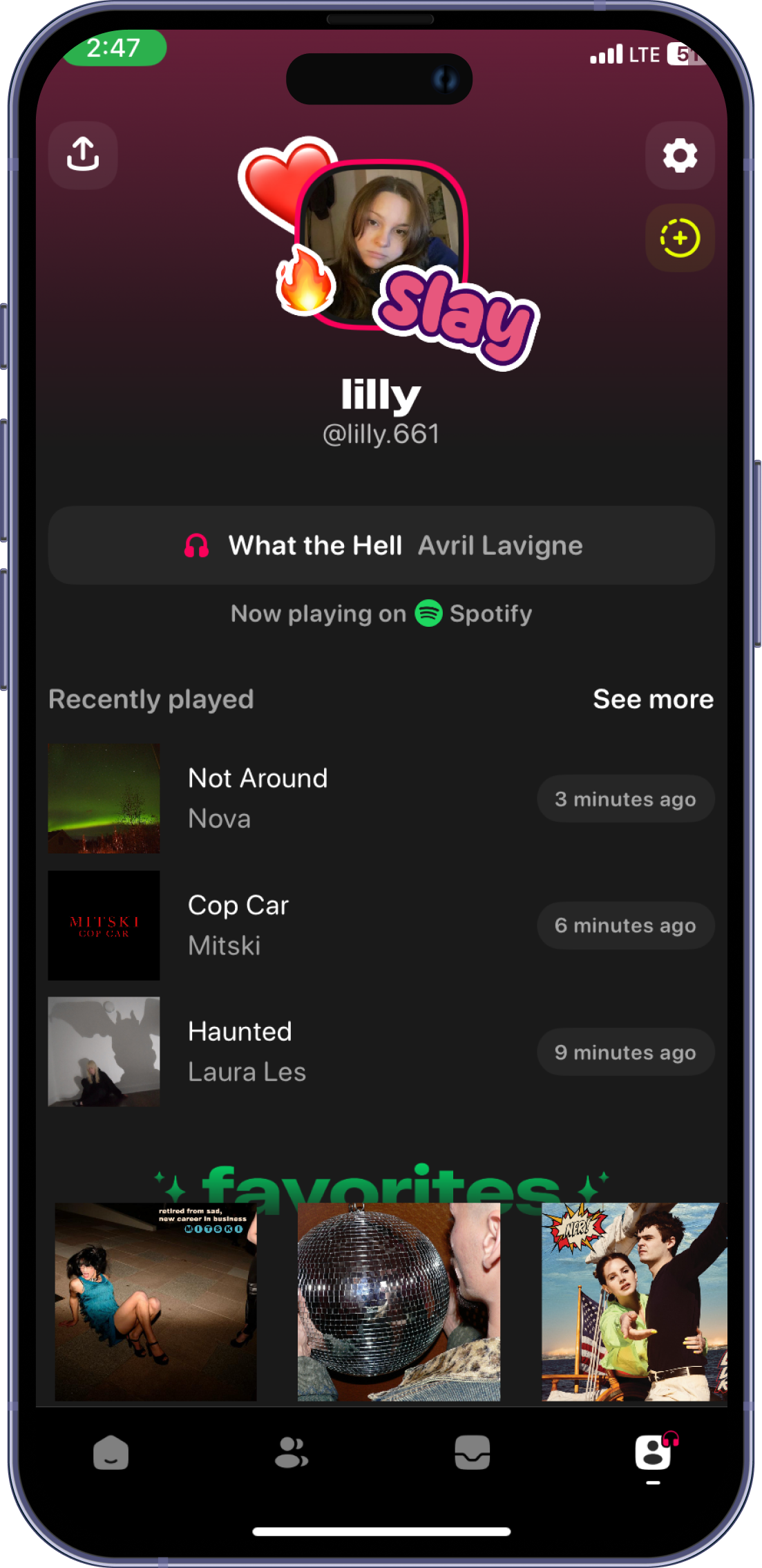
Echostream: echo what you stream to your friends
EchoStream is a social streaming companion that brings people together through shared entertainment. Whether it's music, video games, or movies, EchoStream lets users stay connected by sharing what they’re streaming in real time.
With features like activity feeds, profile recaps, and messaging, it creates a seamless way to discover new favorites, spark conversations, and engage with friends over common interests.
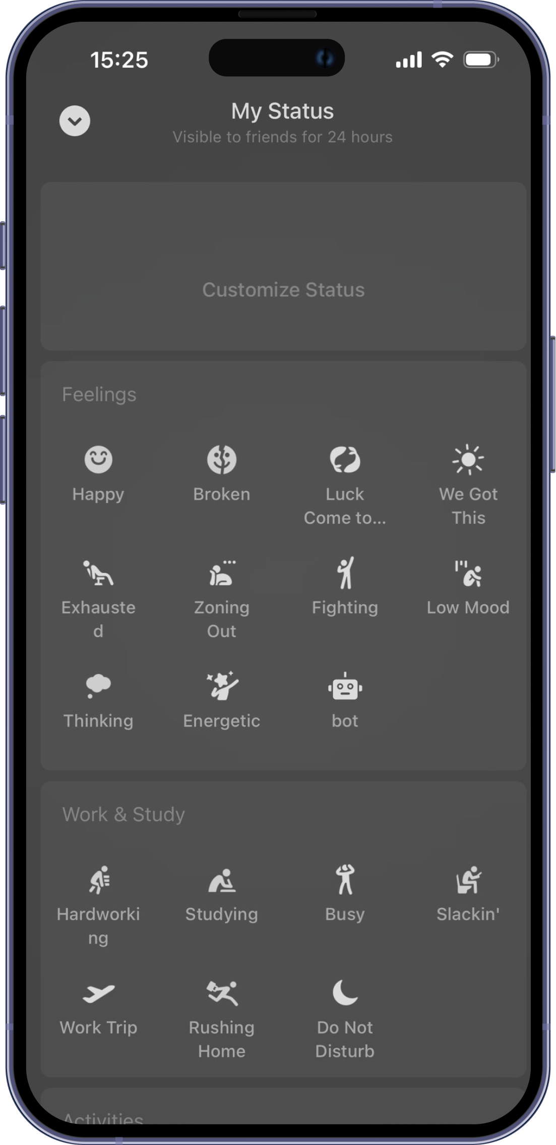
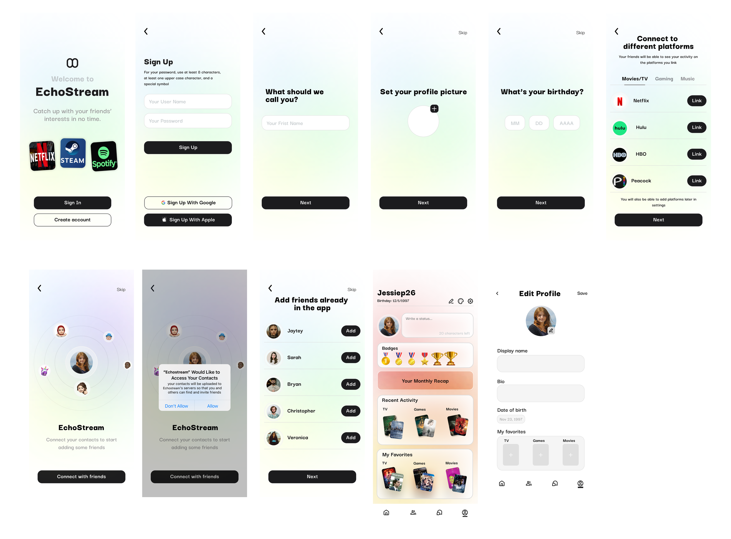
Onboarding design highlights
Our research revealed that people are busy and like convenience, and they don’t like overwhelming notifications. So in our onboarding flow, we:
Provided a skip option, allowing users to breeze through onboarding and avoid drop-off due to lengthy steps.
Enabled one-click syncing with other social platforms and contact lists to prevent users from abandoning the product due to tedious manual entry.
Social feed design highlights
Our research revealed that people are busy and like convenient communication; people like conversation starters, and want to manage relationships at their own pace. So in our activity feed, we added:
Main feed: Users can explore their friends' recent interests by scrolling and sending emojis or comments.
List View: Users can view all their friends' latest activities in a list format and search for specific friends' recent updates.
Best friend list: Users can filter and access the streaming history of their best friends.
chat feature design highlights
Our research revealed that people like conversation starters, and people like to reach out when they have shared interests. So users can:
View a friend's recent status in the Friend List and send direct messages to them.
Create group chats to discuss shared topics with friends who have similar interests.
Want to see more?
Please access the resources below to see our final presentation and the final interactive Figma Prototype.
REFLECTIONS
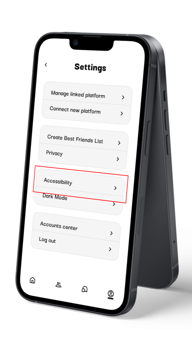
If we had more time, we’d focus on accessibility
In our interviews, we spoke with two individuals who were in the 50-60 age range. They both said they would be interested in using this platform, so we will be thinking of age-friendly accessibility features in the future as we build on the app.
These include:
Adjustable text sizes
High contrast modes for users with poor vision
Offer text-to-speech features
Dark mode and light mode
These features would, of course, extend to assist other populations as well.
What i learned from this experience
This was a really fun project! I had a great partner, and we were both dedicated and willing to put the time into something we were proud of. Some specific highlights are:
The Importance of Feedback
At first, I wasn’t a big fan of the inclusion of printing out updates for our designs every week - it felt like a hassle since we usually do everything digitally as UX professionals. However, my opinion quickly changed. Being able to get weekly feedback from classmates and our professor and to work on potential problem solutions was extremely helpful in the long term.Designing for Mobile
This project was for a class focusing on mobile interaction design. Before this class, mobile designs very much felt like an after thought to me, and taking this class made me realize how untrue this is. We use our phones for everything! Especially apps that focus more on social connections and communication. The experience changed the way I view desktop and mobile, and I’ve grown to appreciate both of their use cases.