Full Website Redesign
Full Website Redesign
Designing Hatemap.io: Accessible UX for Complex, Credible, and Community-Focused Data
Roles:
Account Manager, UX Designer, UX Researcher, Strategist
Team Members:
Lillian MacGuire, Rohan Boda, Manjot Kaur, Jeffrey Delacruz
Tools:
Figma, FigJam, Figma Slides, Zoom
Duration:
14 Weeks
SUMMARY
Abstract
The Khalifa Ihler Institute is a global peace-building organization dedicated to fostering inclusive communities and addressing critical issues through targeted efforts. Their website features various initiatives, including The Hate Map, an online resource that tracks and visualizes hate crimes worldwide with interactive maps and dynamic data displays.
For this project, my team focused on improving The Hate Map by identifying usability challenges, addressing gaps, and proposing enhancements to better serve its diverse audience. Our final deliverables included a Figma prototype, a design system, and a presentation detailing our design decisions.
KICKOFF & RESEARCH
Understanding the hate map
The Hate Map project aims to shed light on the drivers, perpetrators, and victims of hate-driven incidents while fostering prevention and protection. Our goal was to redesign the user experience and improve communication and media collaborations to make the platform more accessible, user-friendly, and impactful.
During our kickoff meeting with Bjørn Ihler, he emphasized that while the primary audience includes anti-terrorism professionals—such as researchers, journalists, and data visualization experts—the redesign should broaden its reach to casual users and effectively convey the global impact of terrorism.
Defining the Core Design Challenge
To guide our work, we developed the following How Might We question:
“How might we design an accessible and engaging hate map that helps professionals and communities understand the interconnected nature of global terror incidents while supporting awareness and responsible engagement?”
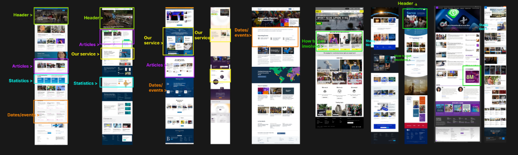
An initial review of Hatemap.io revealed limited contextual information and community support, so we conducted heuristic and competitive analyses using Jakob Nielsen’s Ten Usability Heuristics to identify opportunities for improving clarity, usability, and engagement.
Below, you will see an image of our competitive analysis, from similar websites to The Hate Map:
We needed to learn more about complex data visualization
To continue building off our How Might We statement, we delved deeper into a big challenge of this project: The map itself.
As UX students, we had limited experience working with complex datasets, particularly ones as sensitive as terrorism data. Hence, we reviewed existing literature to understand how blogs and publications represent sensitive topics.
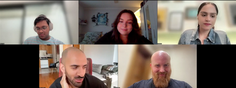
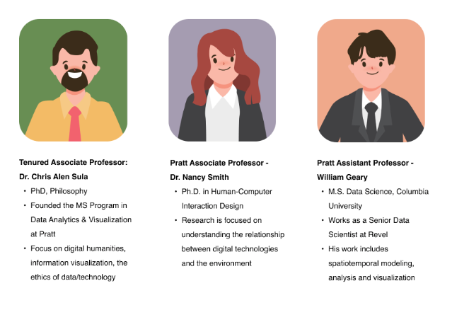
We also interviewed research professionals and internal stakeholders to understand their research process and expectations when interacting with visualizations and websites.
We created scripts for these interviews to guide the conversations and optimize time.
Below, you will find the background information on the experts we interviewed:
Once we understood the challenges, we created design goals
Make the data accessible and engaging while exploring ways to tell complex stories
Keeping in mind that we have a broad user base on the site
Improve the user experience of the site, and encourage community building/engagement
Keeping in mind that community-based content needs moderation
Revise the map to keep users actively engaged and interested
Keeping in mind that we have limited data available
SYNTHESIS & SITE MAP CREATION
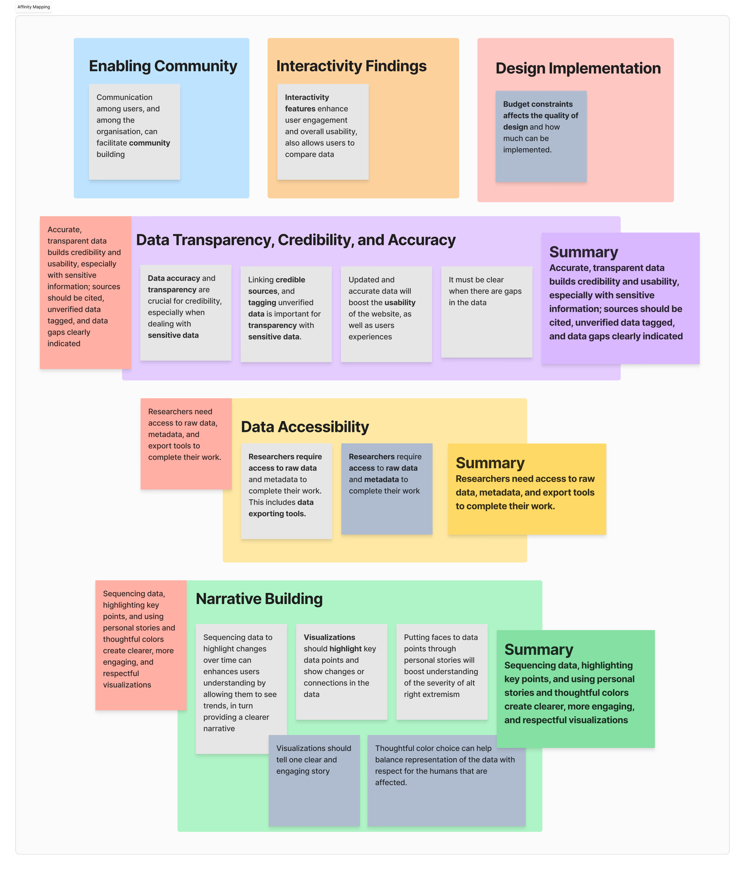
Synthesizing inspection method, literature review, and interview findings
We conducted an affinity mapping exercise to distill our findings into meaningful insights and identified the following:
We can empower users and boost engagement by simplifying data.
We can foster inclusivity and trust by supporting all user expertise levels.
We can build a thriving community by enhancing engagement, collaboration, and communication.
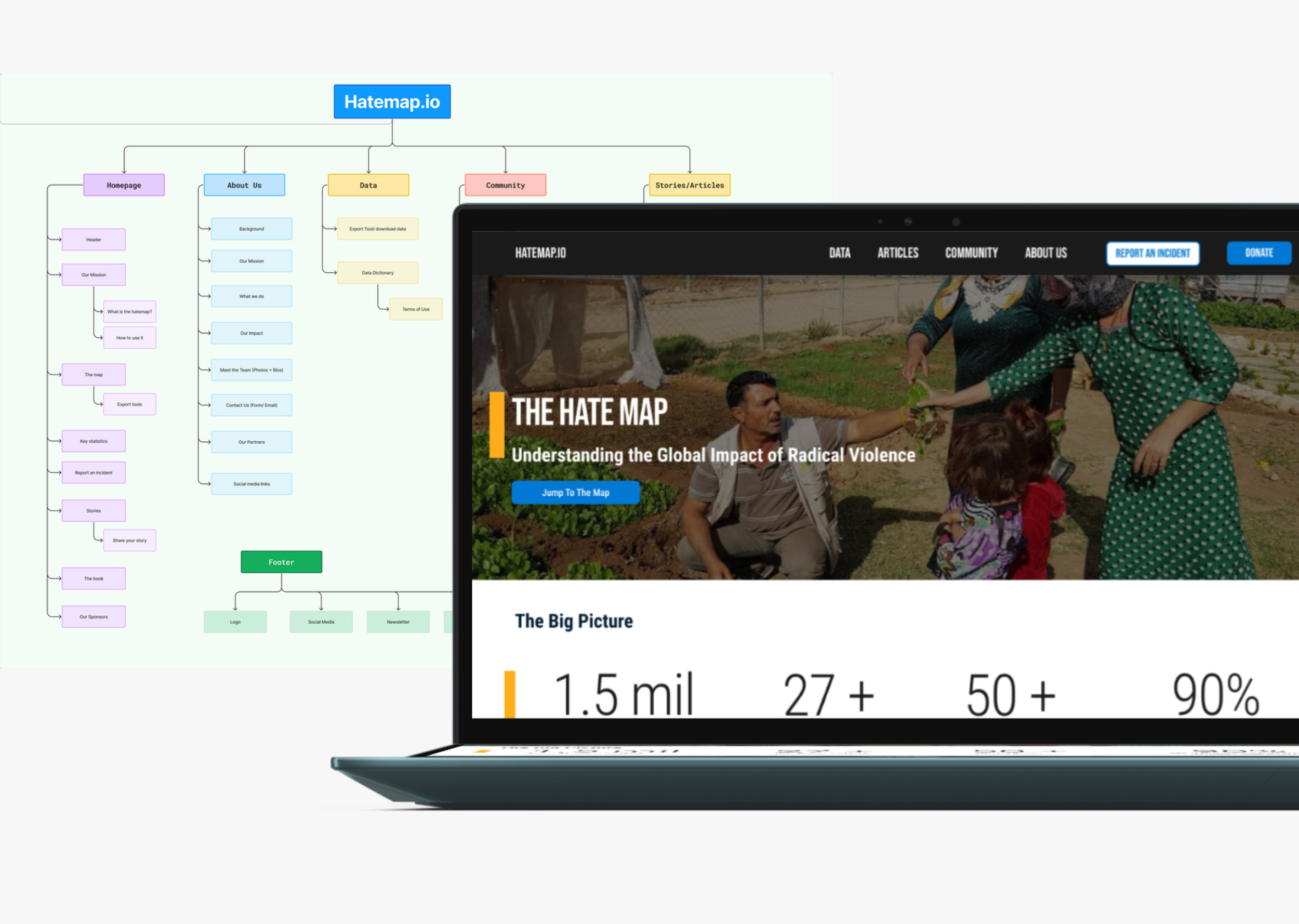
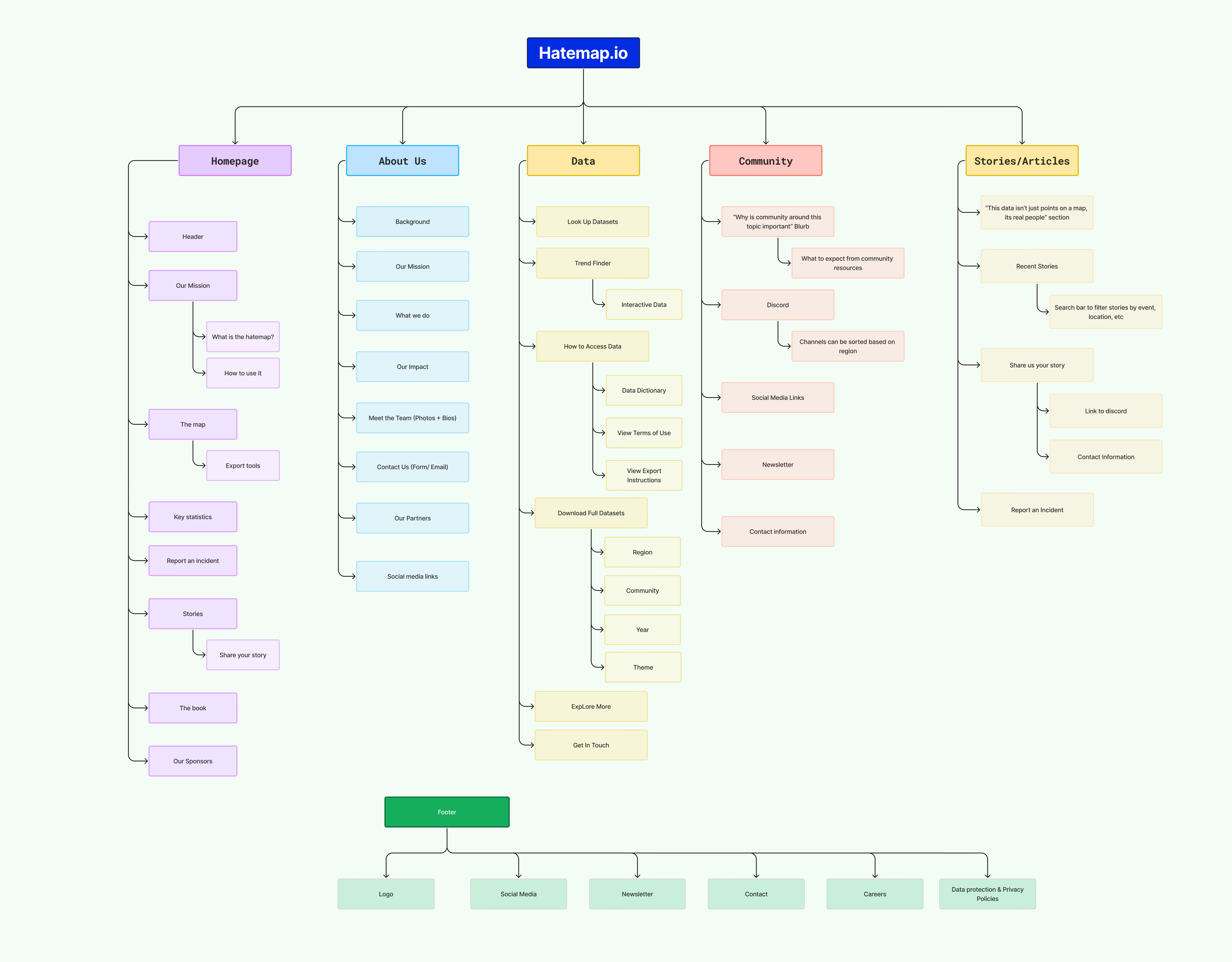
Applying our findings to create our site map
After completing our research collection and synthesis, we structured the site to have 5 main pages:
A welcoming homepage
An about us page detailing the background about the organization
A data page, allowing researchers easy access to data materials
A community page that could help bring people together in the fight against terrorism
A stories page to detail personal stories from those affected by terrorism and an articles page to display the latest news.
WIREFRAMING
implementing a strategy and guiding principles
To help us make our wireframes, we utilized the following strategy:
Establish Khalifa Ihler/HateMap.io as a welcoming, trusted, and accessible information hub.
We accomplished this by using the following guiding principles:
Creating a usable website that simplifies data
Highlighting key insights and statistics
Fostering inclusivity among users
Enhancing engagement through clear communication channels
Creating wireframes and iterating with the client
Our team created initial website wireframes and reviewed them with the client during an in-person workshop. To keep the process flexible and collaborative, we used whiteboards so ideas felt easy to adjust rather than locked in.
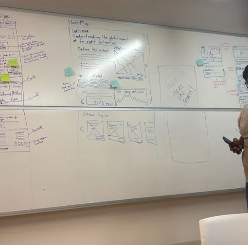
As we iterated together, we identified gaps around page content and used that as an opportunity to bring the client, Bjørn, directly into the process. In a follow-up working session, we reviewed the wireframes together, refined page titles and section headings, and aligned on which content blocks belonged on each page.
By the end of this collaborative iteration, we had a shared, clearly defined structure for the site—ensuring the final designs reflected both our strategic direction and the client’s vision.
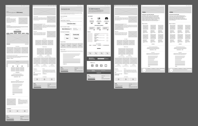
FINAL DESIGNS
Final designs - translating strategy to screens
Since Hatemap.io was an incomplete site when we embarked on this project, we expanded the site to have more pages. These pages include:
Home
Data (Including a Trend Finder)
About Us
Community
Articles
We also made sure to incorporate our strategy into our design mockups:
Establish Khalifa Ihler/HateMap.io as a welcoming, trusted, and accessible information hub.
CLIENT REACTIONS
Handoff - final client review and response
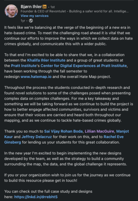
We pitched our final designs to our client, Bjørn Ihler, remotely.
Below, you will see a LinkedIn post Bjørn made once receiving his deliverables, stating:
“In the new year, I’m excited to begin implementing the designs developed by the team, as well as the strategy to build community around the map, the data, and the global challenge it represents.”
This design will aid him in fundraising to bring the website to life.
reflections and key takeaways
This project was both challenging and incredibly rewarding. It was my first time managing a client with minimal professor oversight, which came with a learning curve. However, once I established a routine, everything started to fall into place.
Great Collaboration = Great Work
After some less-than-ideal group project experiences, I was initially nervous about tackling such a big project with a team of new collaborators. However, this turned out to be an amazing experience. My team met twice a week and worked closely together—sometimes even just co-working silently on Zoom—to keep things moving forward.A Deeper Understanding of Data Visualizations
Coming from a psychology background, my experience with visualizations was mostly limited to graphs and charts in Sheets or Excel. Through interviews with data visualization experts, analyzing other examples, and gaining a deeper understanding of The Hate Map’s data, I developed a real appreciation for what makes a visualization effective.Designing for Diverse Users
HateMap.io had a unique challenge: serving both professionals in the field and engaging novice users to take action against hate. Balancing these audiences required multiple iterations, but the effort was well worth it.