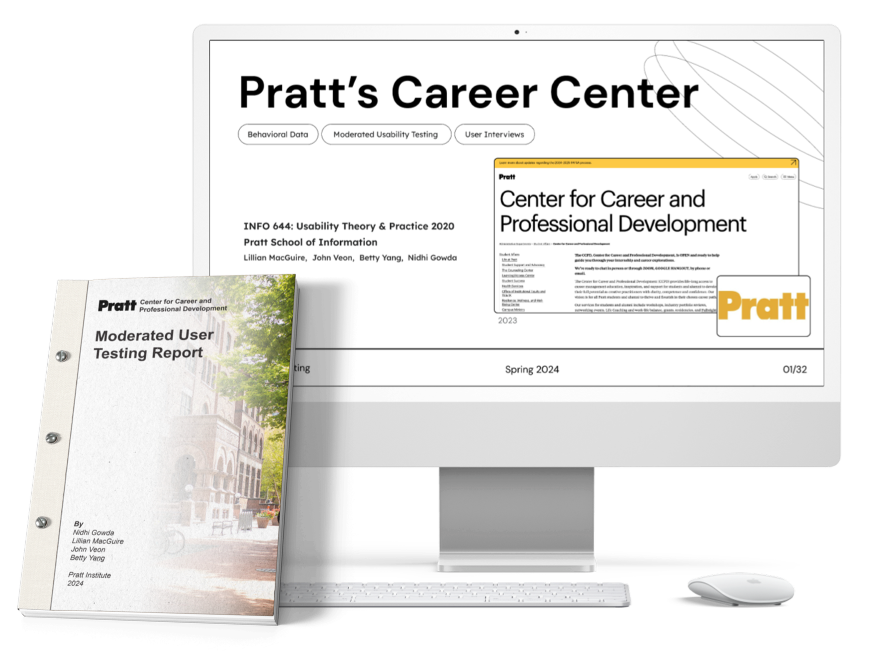
Moderated User Testing
Moderated User Testing
Enhancing Usability: User-Centered Design Recommendations for Pratt's Career Services Website
Roles:
UX Researcher
Team Members:
Lillian MacGuire, Nidhi Gowda. John Veon. Betty Yang
Tools:
Figma, Figma Slides, Zoom
Duration:
6 Weeks
SUMMARY
Abstract
Pratt’s Center for Career and Professional Development (CCPD) is dedicated to providing services to students to help them build skills and prepare materials for job searching. For this project, we were tasked with making sure students and alumni were able to access these beneficial services that the CCPD offers.
Over 6 weeks of moderated user testing surrounding key tasks that real users would be seeking to complete. Based on these tests, we were able to create recommendations to boost the accessibility of these services. These recommendations were created as mockups in Figma and presented in the form of a slide presentation and formal research report.
BACKGROUND & STUDY DESIGN
Identifying Goals: A Conversation with CCPD
We met with CCPD Director Marias Lobianco over Zoom to understand her goals. Her key questions focused on whether students could easily access CCPD services (e.g., resume reviews, workshops, career fairs) via the website and how they currently navigate these features—through the site or alternative platforms, such as Handshake or email.
This discussion clarified priority areas for usability testing and reinforced our focus on the desktop experience, as students primarily use desktops for school tasks. We also identified a key constraint: the CCPD site is a subsection of Pratt’s main website, meaning any design recommendations must align with its existing template
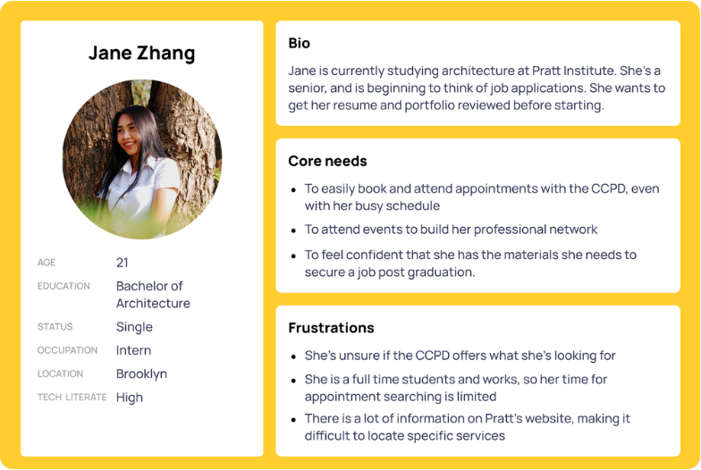
Insight to Identity: Building the User Profile
In our initial kickoff, we identified key insights about Pratt CCPD users. Both students and alumni use these services, primarily when preparing for internships and job searches.
Following the meeting, we developed a user profile to better empathize with our target audience.
Recruitment: Reaching the Resume Builders and Job Seekers
To recruit participants for testing, we created a screener questionnaire targeting our defined user group. We asked general demographic questions to ensure we were getting a diverse group of students from unique backgrounds, minimizing any potential bias
We shared our screener through flyers around Pratt’s Brooklyn campus and, with help from our client, an email blast via Handshake, reaching a total of 46 undergraduate students. From this pool, we selected a total of 8 participants and reached out to schedule testing.
Crafting a study as diverse as the campus
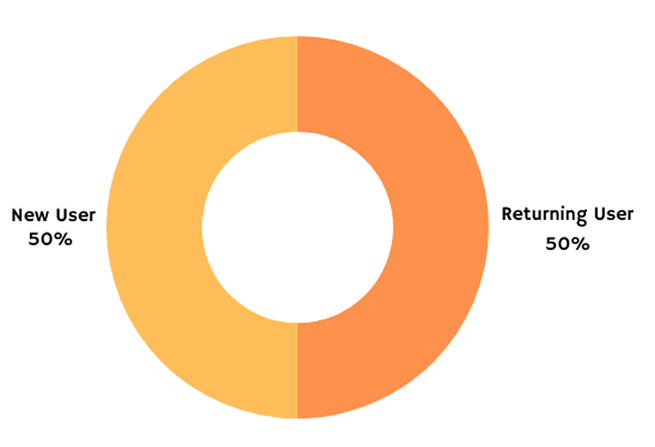
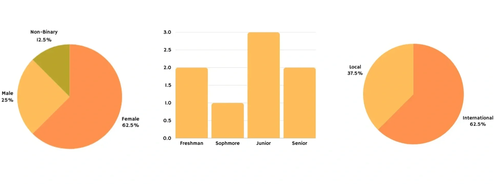
Pratt is a diverse New York City school, and we aimed to reflect that diversity in our participant selection by including students across different grade levels, domestic and international backgrounds, a range of genders, and both new and returning users to capture varied perspectives and experiences.
TESTING
Putting the site to the test
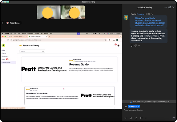
We conducted a moderated, remote think-aloud usability study centered on key CCPD tasks. The study gathered both qualitative and quantitative data through observation and direct questions, with participants completing pre-test, post-task, and post-test questions. To ensure consistency, all moderators used a structured script, and a pilot test confirmed sessions could be completed within 30 minutes.
Key tasks included:
Finding resume review services and checking appointment availability
Exploring CCPD-hosted career events
Locating workshop information for a friend
Accessing portfolio review services
Finding alumni connections for career advice
Quantitative metrics included:
Satisfaction rating
Ease-of-use rating
Time on task
Error rate
CCPD website is clear in concept, confusing in execution
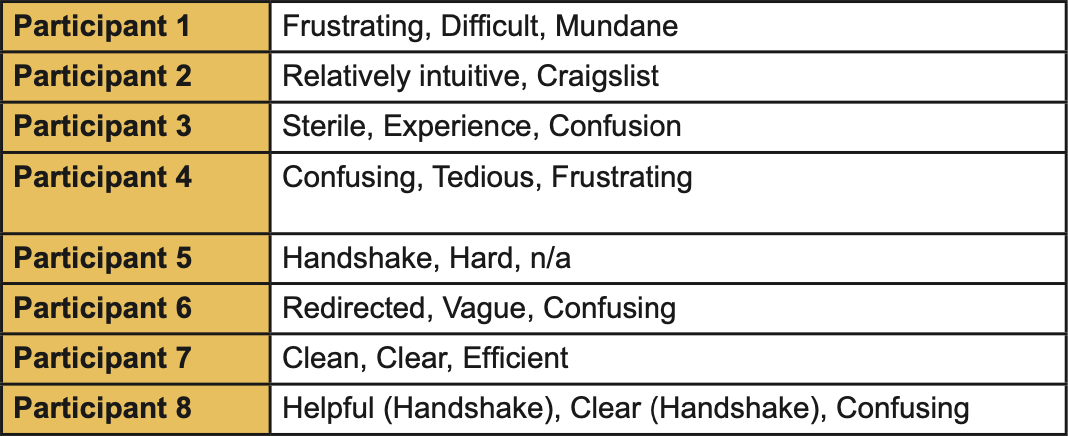
Usability testing revealed major issues with the CCPD website. Most participants described their experience using negative terms such as frustrating, confusing, and tedious, pointing to significant usability and design challenges.
While a few found some elements intuitive, comparisons to Craigslist highlighted outdated visual design, and only two participants used positive descriptors—one of which referred to Handshake, not the CCPD site.
Another post-test question was as follows:
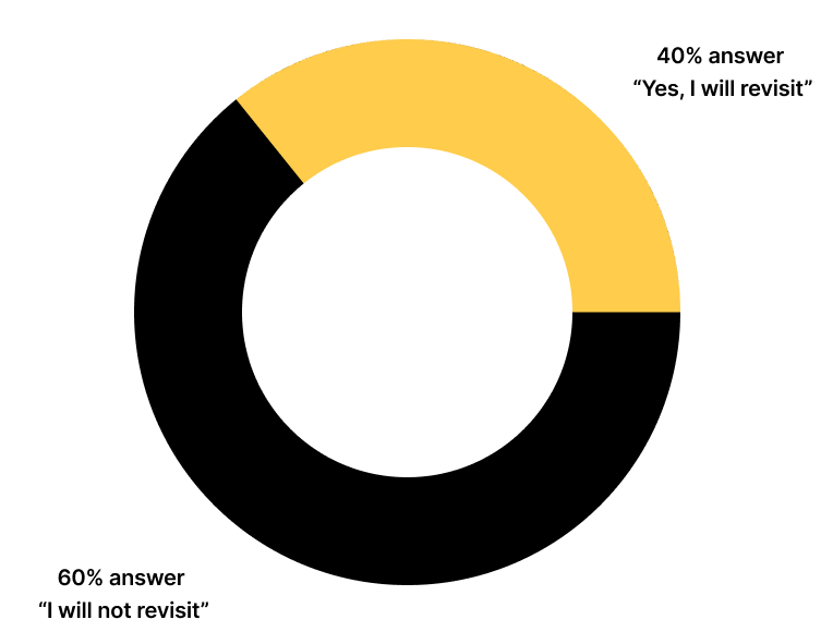
“After your experience with the current CCPD website, would you be inclined to revisit it?”
Most participants stated they would not be inclined to revisit the website, even if they found the services useful.
Prioritizing Pain Points for CCPD Website Improvement
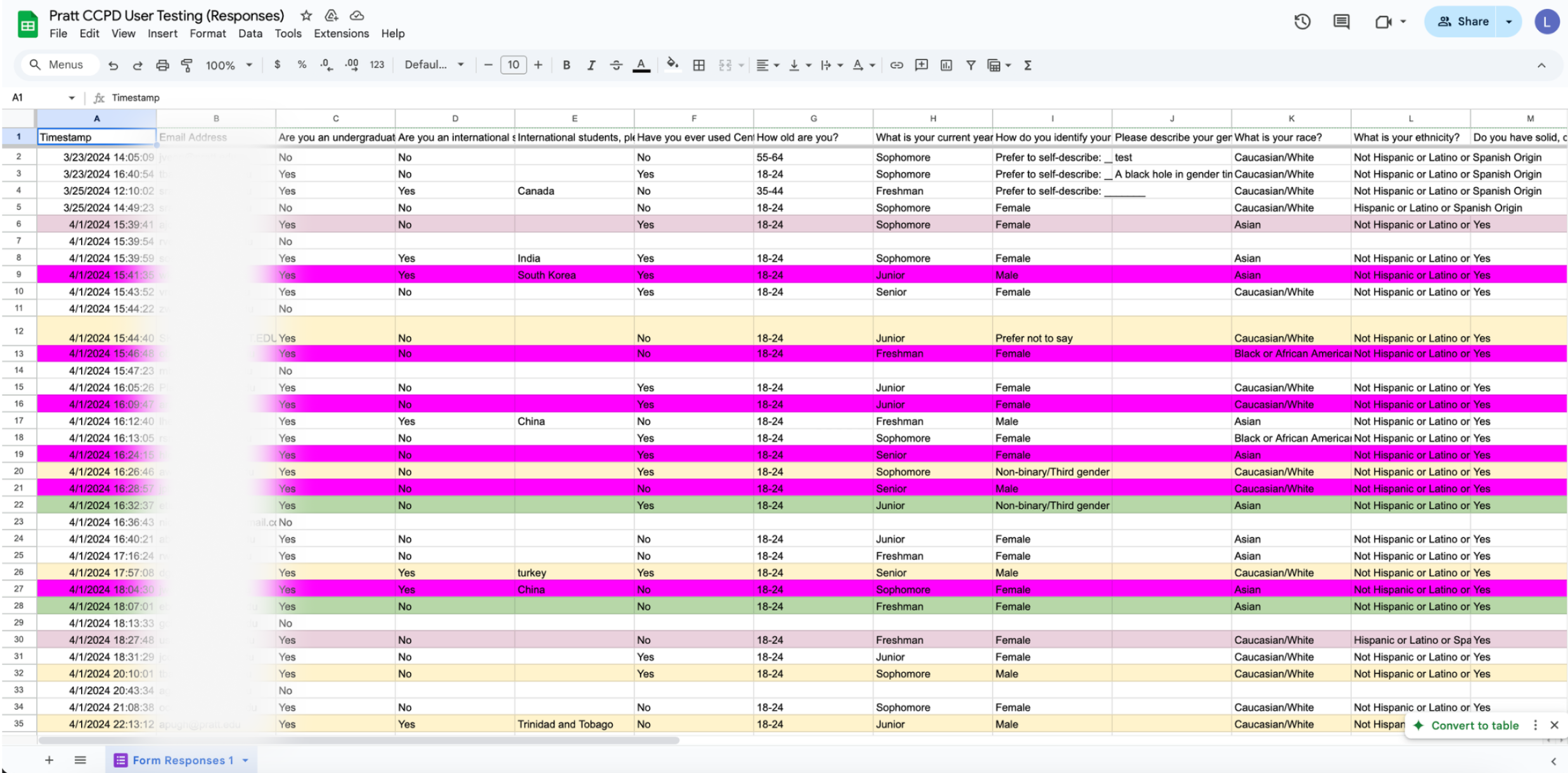
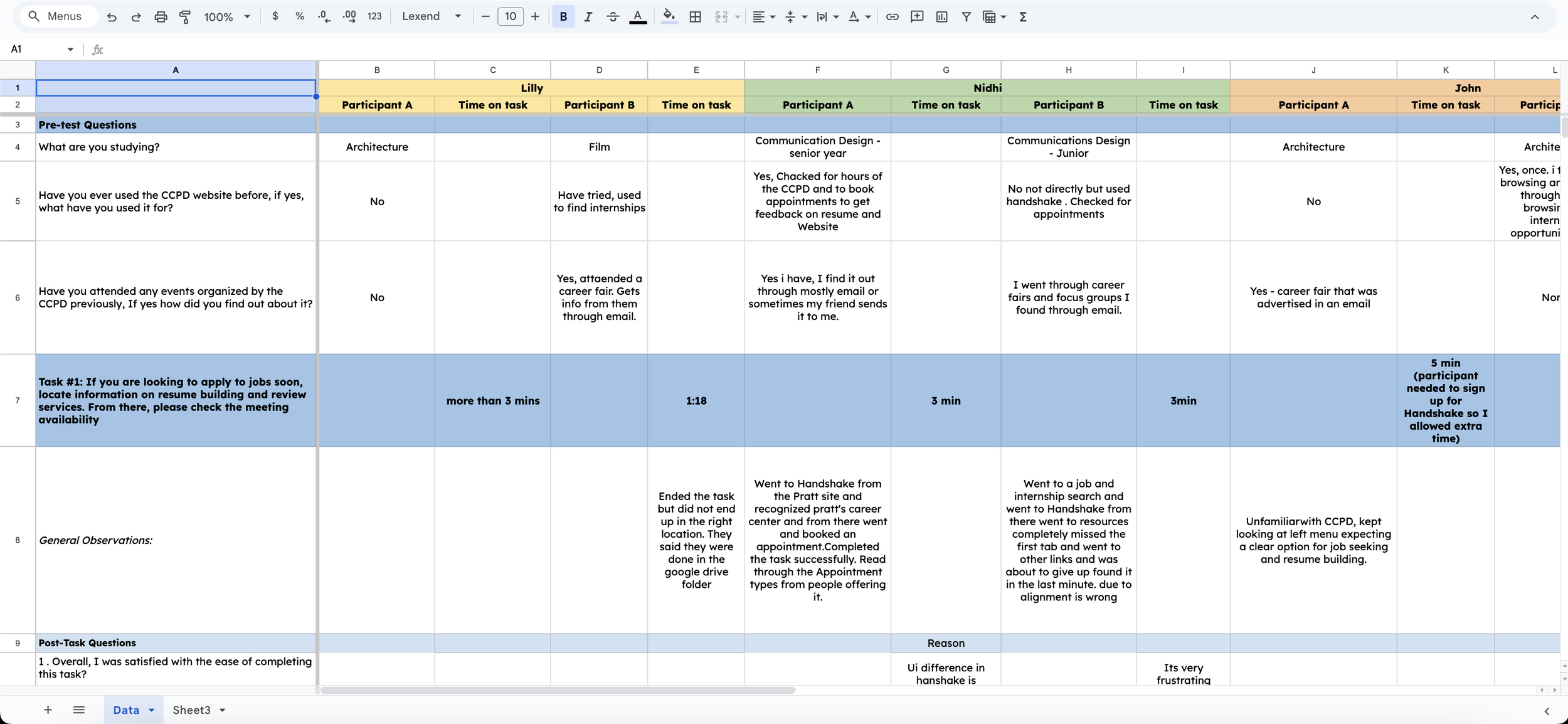
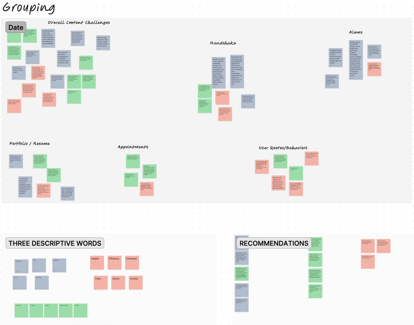
All evaluators were responsible for testing with 2 participants and recording the results in a shared Google Sheet. When we came back together as a team to debrief our testing, It became clear our participants encountered similar issues when completing the provided tasks.
We grouped these similar findings into categories through affinity mapping; for example, all the participants whose results demonstrated issues with appointment scheduling were placed into the “Portfolio/Resume” bucket. Prioritization decisions were made based on the frequency of the labeled themes while also considering the impact-to-effort ratio.
We prioritized issues based on participant severity ratings and how frequently they occurred, then presented four in-scope recommendations to the client:
Reorganize dense content and add relevant images to improve scannability
Add deep links to corresponding pages in Handshake
Remove non-CCPD items from the left-side navigation
Add a sticky button linking to the CCPD FAQ
All recommendations accounted for the site’s strict template constraints. The next section details these changes with before-and-after visuals.
FINDINGS & RECOMMENDATIONS
Proposed recommendations
Finding 1:
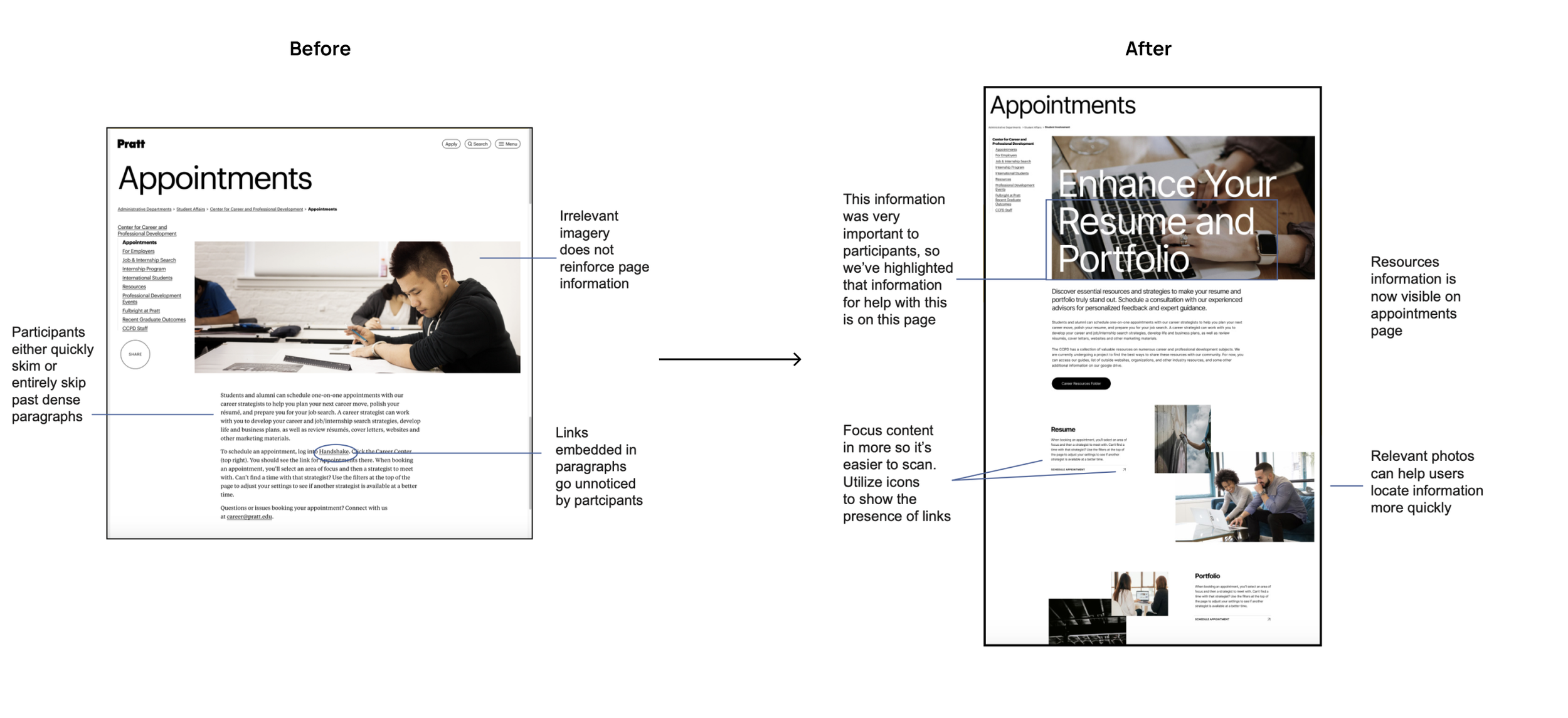
Participants struggled to locate key information on CCPD pages due to dense text, unhelpful imagery, and unclear external links embedded within paragraphs.
Recommendation 1:
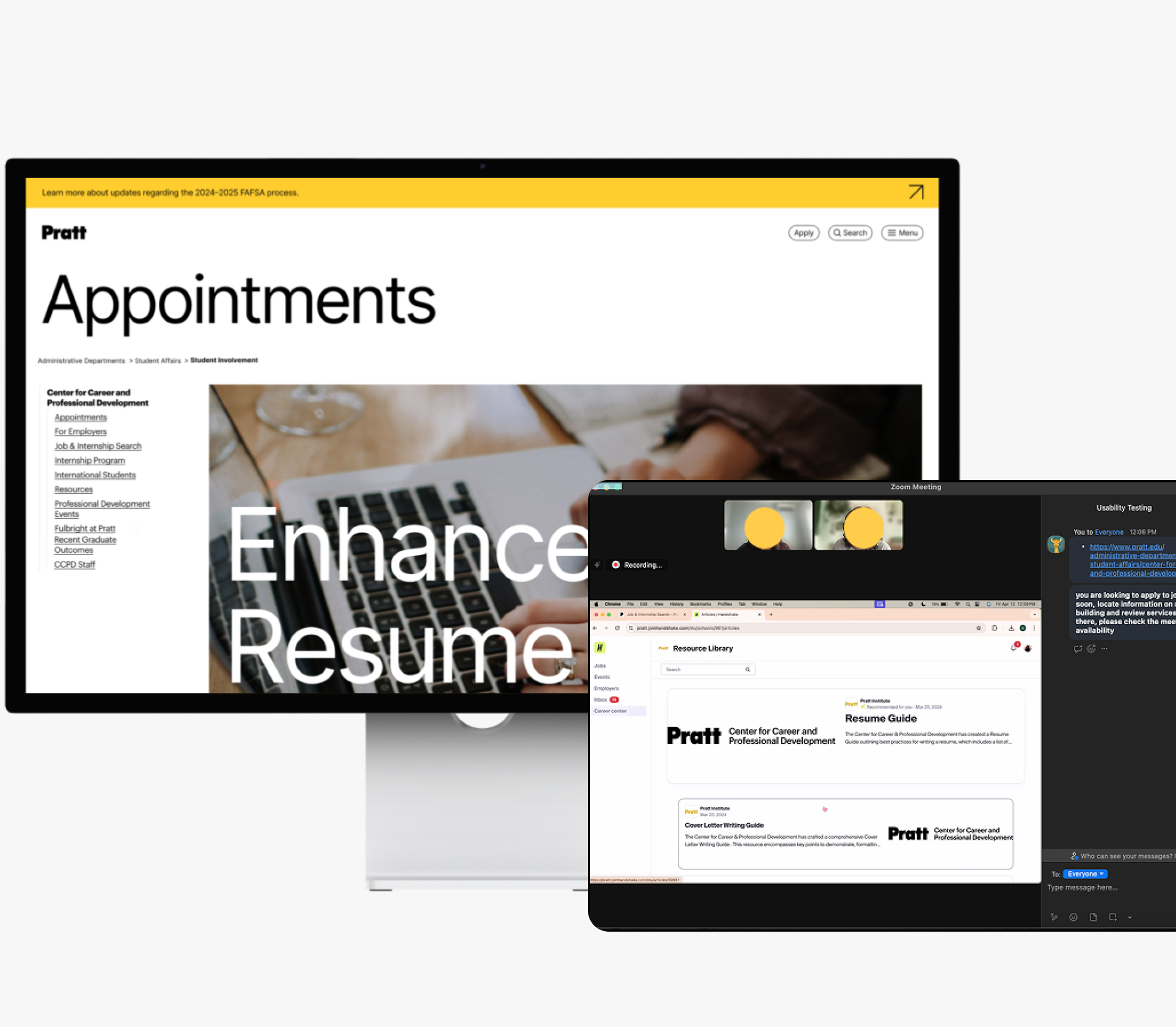
Reorganize content to improve scannability and add relevant images to support content searching. We combined the resources and appointments pages to reduce confusion, added purposeful imagery to guide users, restructured dense text into clear sections, and made the “Schedule Appointment” link more prominent and clearly clickable.
Finding 2:
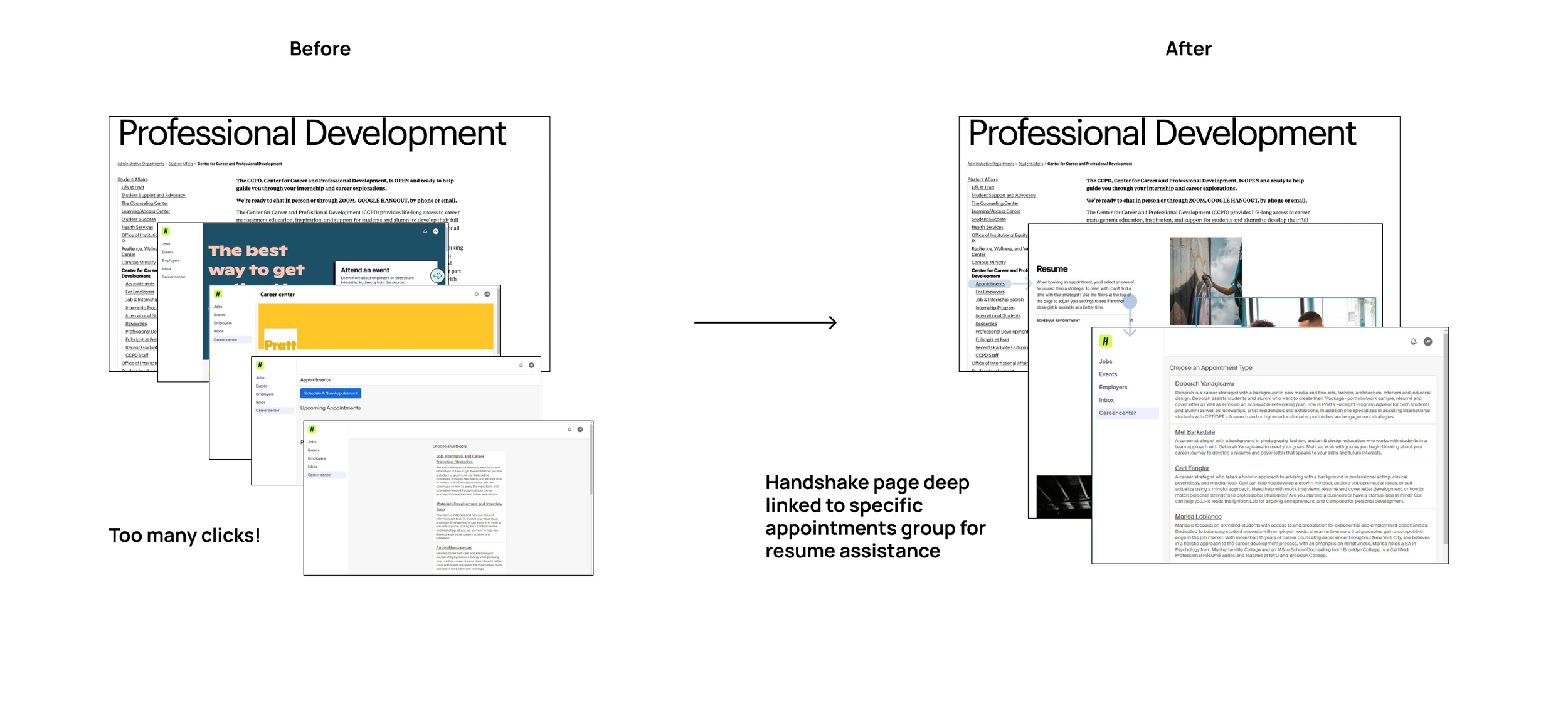
Users found it difficult to locate portfolio services and resume-related appointments, spending excessive time searching across the CCPD site and Handshake due to unclear labels and fragmented navigation.
Recommendation 2:
Add deep links from the CCPD appointments page directly to the relevant Handshake appointment pages (e.g., resume or portfolio help) to reduce confusion, clicks, and user frustration.
Finding 3:
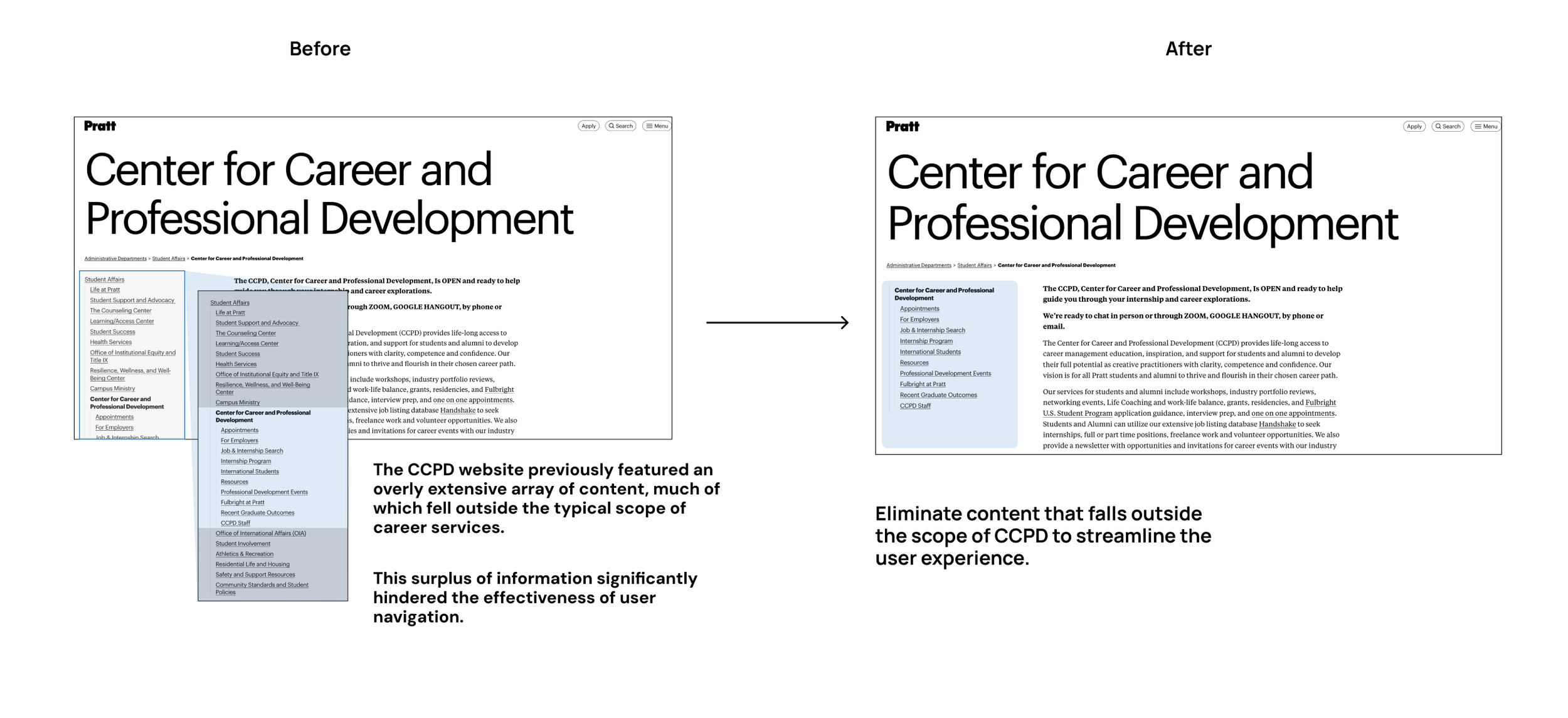
The side navigation bar is cluttered with irrelevant content, making it difficult for users to find important CCPD information.
Recommendation 3:
Remove non-CCPD items from the left-side navigation to streamline the experience and improve access to relevant resources.
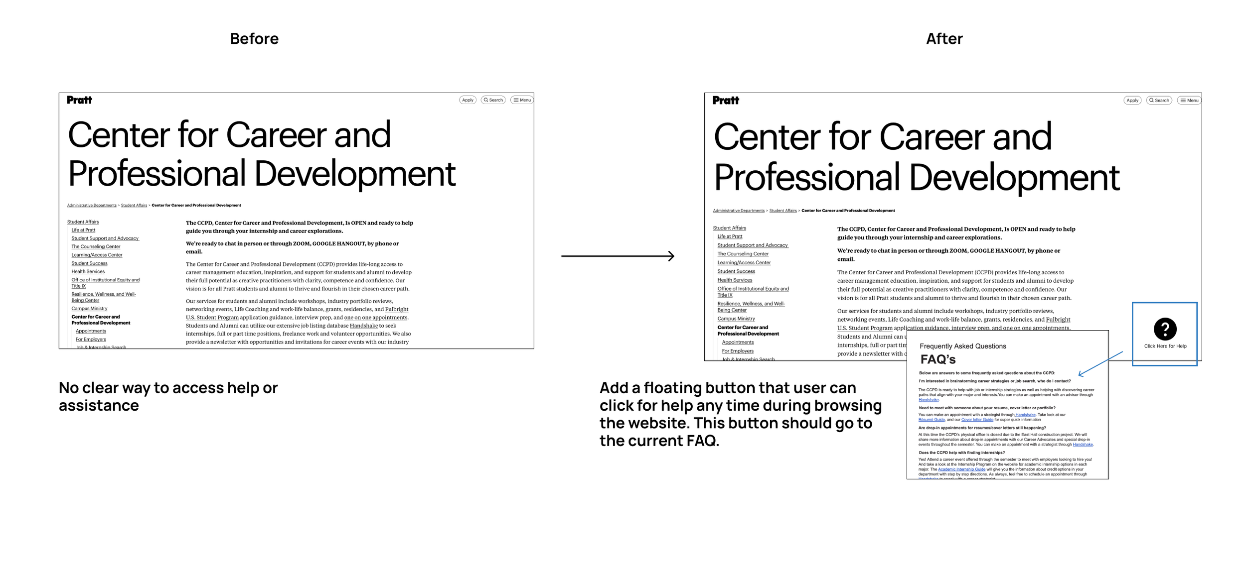
Finding 4:
Users struggle to locate essential information and contact options, often clicking through multiple sections out of frustration.
Recommendation 4:
Add a sticky “Click Here for Help” button on all pages linking to the CCPD FAQ, providing quick access to support and improving overall usability.
DELIVERABLES & CONCLUSIONS
Client reactions and positive feedback
We presented our findings to client Marisa Lobianco and other stakeholders over Zoom, receiving very positive feedback. They noted that our mockups could be implemented into the existing system with minimal issues. Olga Dolah, Admin Assistant to the CCPD, stated:
“I am forwarding this over to the CCPD team. All of us are excited to see your work become a reality. The presentation was very insightful on how the students view our site as well as the CCPD as a whole. The Moderated User Testing Report is very beneficial and insightful, covering our user goals in a comprehensive report. You are wonderful students who put in a lot of hard work, time, and research, and we all truly appreciate it!”
Reflections & Takeaways
This project was my first experience conducting live, moderated usability testing, and I discovered how much I enjoy it! While I had prior experience with heuristic evaluations, cognitive walkthroughs, and unmoderated testing, this was my first deep dive into moderated sessions.
Writing Non-Leading Tasks: Crafting unbiased tasks is harder than it seems. This experience strengthened my ability to create neutral, effective questions.
Value of Pilot Testing: Running a pilot helped us identify pacing issues and condense our script, reinforcing the importance of testing before full sessions.
Staying Silent During Testing: Using the think-aloud method, I learned to remain neutral and avoid influencing participants, ensuring honest feedback.