Eye Tracking Testing
Eye Tracking Testing
Through Students Eyes: Eye Tracking the SVA Library Online Collections Experience
Roles:
UX Researcher
Duration:
11 weeks
Team Members:
Lillian MacGuire, Meng Shi, Qiaochu Zhang
Tools:
Tobi Pro Lab, Tobi Eye Tracker, Figma, Figma Slides
SUMMARY
Abstract
Over the course of 11 weeks, the team conducted an in-depth eye-tracking study to evaluate how users interact with the School of Visual Arts (SVA) library’s online collections database. Using Tobii eye-tracking technology, we observed real-time user behavior as participants attempted to complete key tasks relevant to searching, browsing, and accessing materials.
Our findings informed a set of actionable recommendations aimed at improving the clarity, accessibility, and overall user experience of the database interface. These were translated into design mockups using Figma and delivered alongside a slide deck, a highlight reel of the testing process, and a research summary.
GOALS & TESTING
Establishing Project Goals
In an initial kickoff meeting via Zoom, we met with Phoebe Stoneking, the Digital Services Librarian at SVA. Through this conversation, we were able to pinpoint a clear project goal to base our research plan and test tasks around:
“Analyze user behavior and visual attention on the SVA Online Collections website to understand navigation, search interactions, and resource discovery, identifying usability issues to improve intuitiveness and self-service.”
We were also able to understand the constraints of the project in this meeting, learning that the SVA Online Collections uses Springshare to host their databases.
Participants? real users with real tasks
We identified SVA students as our primary testing group. Participants were recruited through a Google Form that captured key behavioral data, including:
Prior experience with online collection resources
Primary device used (phone or desktop)
Eye-tracking eligibility through screener questions, ensuring compatibility with the Tobii eye tracker, our main tool for data collection in this study.

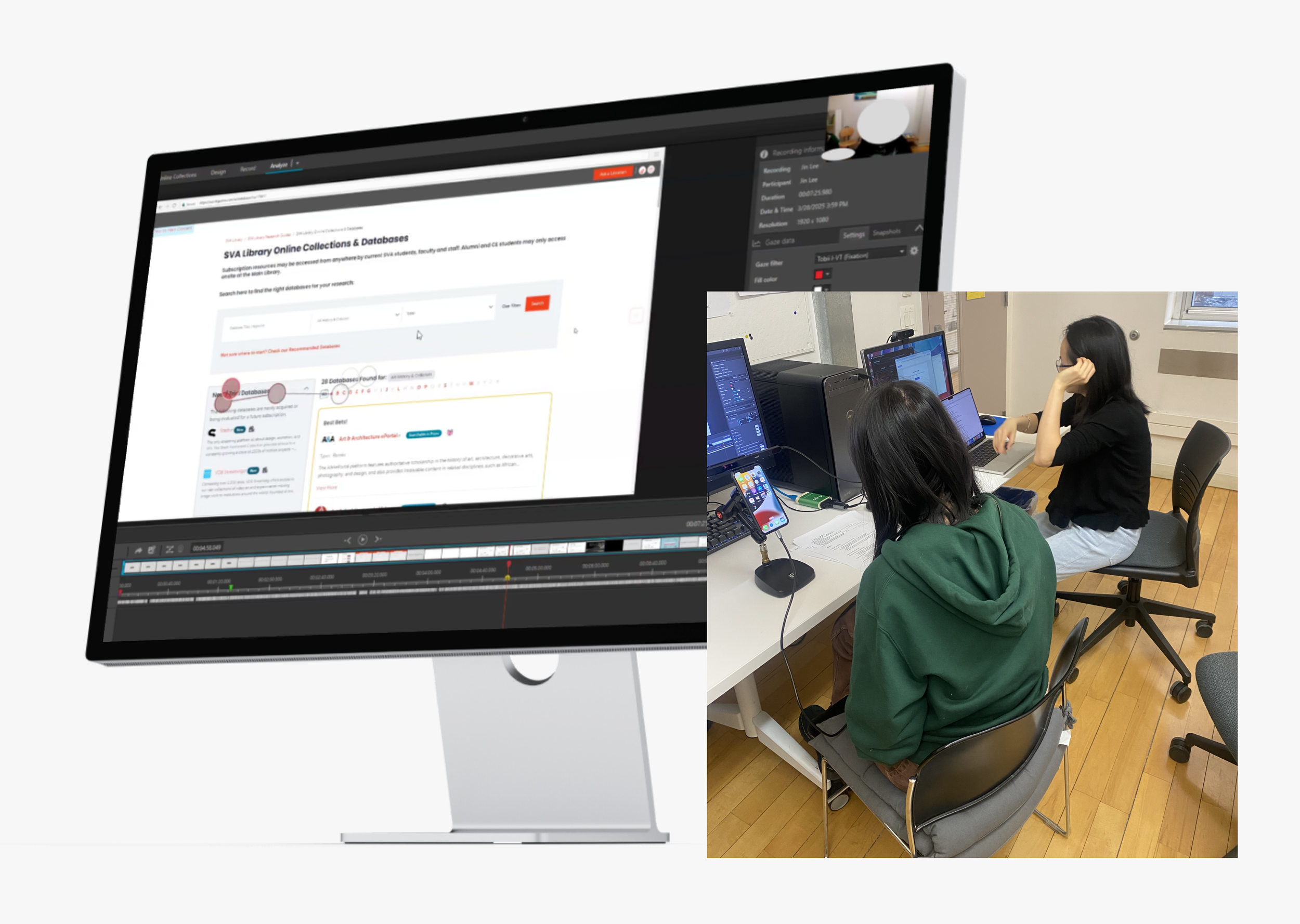
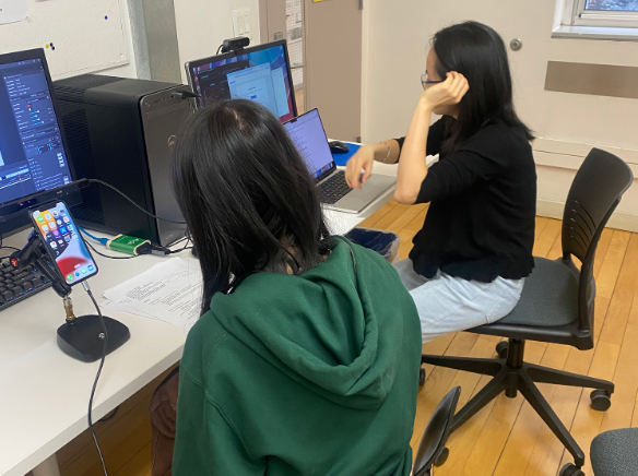
Seeing what users see: eye tracking as a tool
We conducted eye-tracking research using Tobii, paired with retrospective think-aloud (RTA) interviews to capture user reasoning. To supplement qualitative insights, we used the System Usability Scale (SUS) to evaluate overall usability.
Tasks were designed to reflect natural user behavior while covering key areas of the interface, including:
How easily users could locate the Online Collections database from the SVA homepage
Whether users could identify and use the search bar effectively
If users could find and apply advanced filtering options
Whether users could locate curated subject guides to support their research
If users could identify where to go for help on the site
We tested 12 participants. While both platforms were assessed, early recruitment data confirmed desktop as the primary surface, so it became our focus.
ISSUE PRIORITIZATION
sVA’s online collections database is useful, but lacks efficiency
Our eye-tracking tests uncovered several critical usability issues within the Online Collections database—many of which compounded over the course of testing.
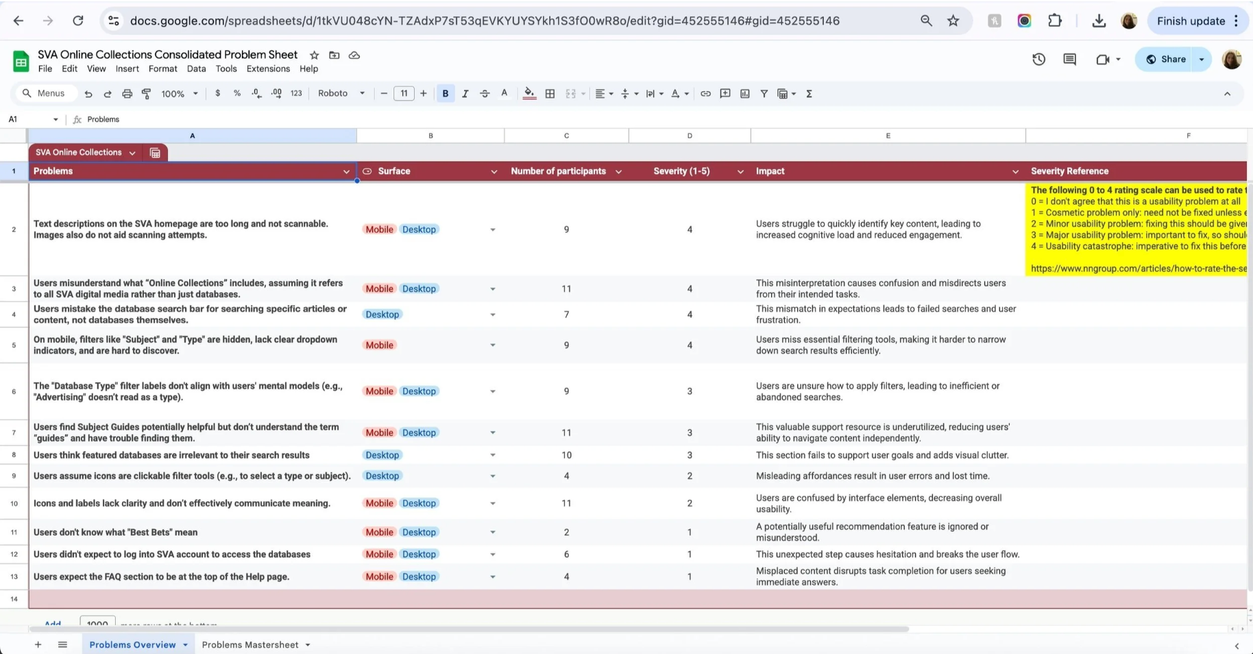
93% of users misunderstood what “Online Collections” referred to. Most assumed it included all of SVA’s digital resources, when in reality, it only links to external databases.
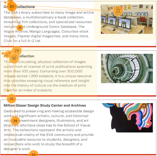
75% of participants found the descriptive text under the Online Collections tab too lengthy, causing them to skip over important information entirely.
Below you will see in a participant’s gaze plot that they read only the headings in this section, skipped over the section descriptions, and skipped over the section images.
Issues snowball into eachother across website pages
Building on earlier findings that users misunderstood what “Online Collections” means, we also saw confusion around how to use the search bar.
The page functions as a database directory, not a catalog of individual books or articles, yet many users searched for specific topics. In one case, a participant searched “Korea Suicide Rate” and received no results.
This issue affected 60% of participants, revealing a significant gap in how the search function’s purpose is communicated.
what needs to be fixed first?
During each session, a second team member served as a dedicated note taker, capturing key usability issues and participant quotes during the retrospective think-aloud interviews. All notes were consolidated into a shared spreadsheet that tracked platform, frequency, and severity.
This process helped us surface and prioritize the most critical issues, ensuring our recommendations focused on what mattered most to SVA
5 high impact solutions for sVA’s online collections
Our top five recommendations were selected because they consistently affected multiple users and created significant friction during key tasks. These issues not only disrupted navigation but also contributed to confusion around the database's core purpose and features.
In the next section, we’ll break down each of these five recommendations in more detail:
Reduce text in the description, use bold text for key information, and select more relevant images to aid comprehension.
Clarify the search function and provide better feedback when search results return no matches.
Improve visibility and usability of filters, especially on mobile devices.
Highlight the subject guide by changing its placement and turning the link into a clear call-to-action (CTA) button.
Standardize the icon set and update icon labels with more descriptive, user-friendly language.
FINDINGS & RECOMMENDATIONS
research findings and proposed recommendations
Finding 1:
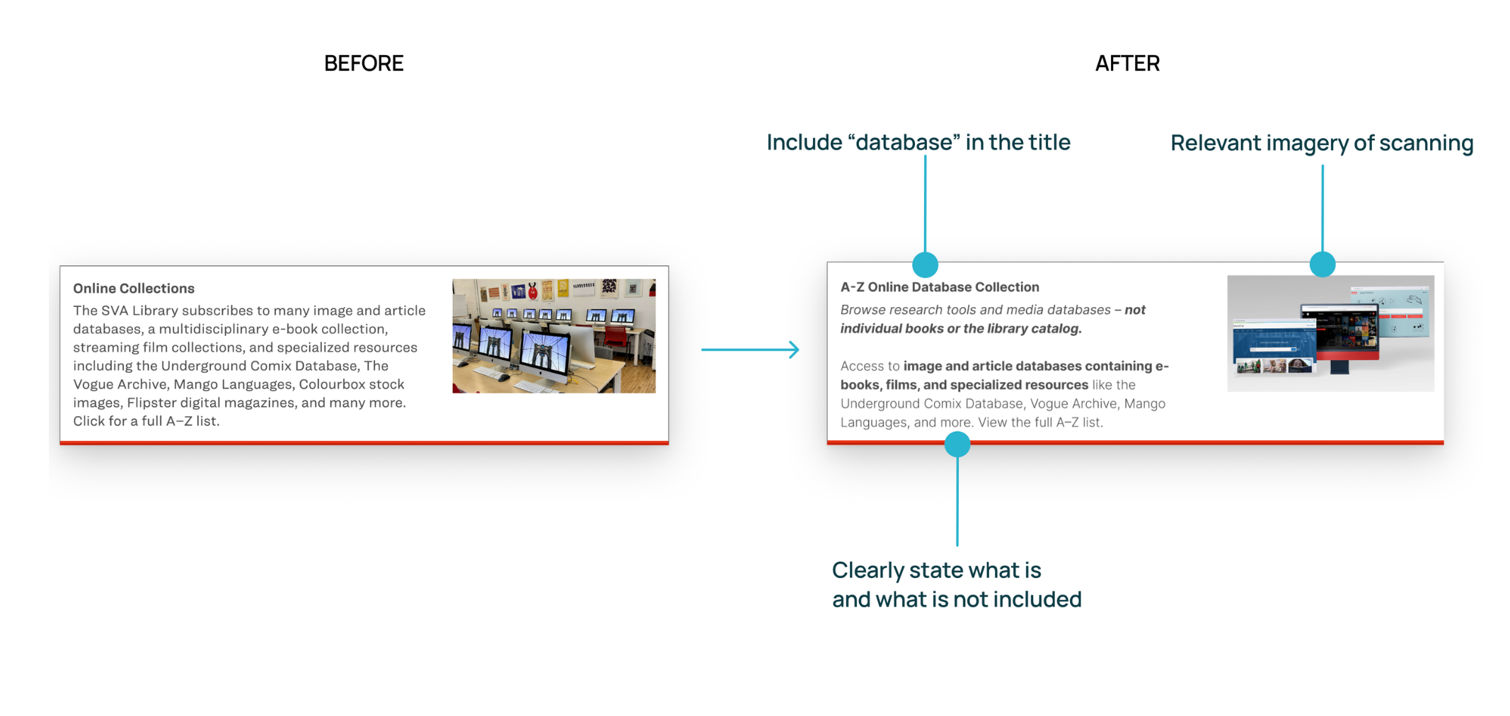
93% of users don't understand what "Online Collections" entails. They believe this incorporates all digital media that SVA provides, not just databases.
75% of participants think text descriptions on the SVA homepage are too long and not scannable. They also believe the images do not aid scanning attempts.
Recommendation 1:
Reduce the amount of text used in the description, and add bolded text for important information
Choose images that feel more relevant.
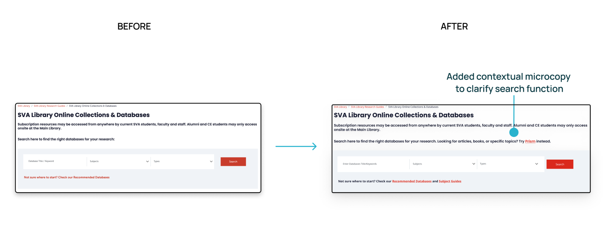
Finding 2:
60% of participants didn’t realize the search bar is meant to help them find databases, not search within them.
Recommendation 2:
Added contextual microcopy to clarify the search function.
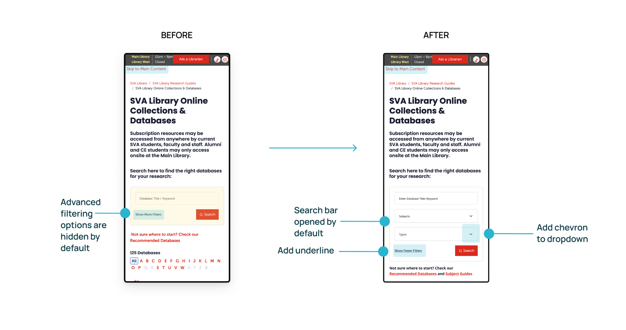
Finding 3:
83% of participants missed the filter option and relied only on keyword search on mobile.
When we asked participants to search for an art history database that includes articles, 5 out of 6 of them didn’t use the filter at all.
Recommendation 3:
Make filters more visible and usable on mobile.
Finding 4:
92% of users find subject guides potentially useful but struggle to discover them
83% of users think new & featured databases are irrelevant to their search results
Recommendation 4:
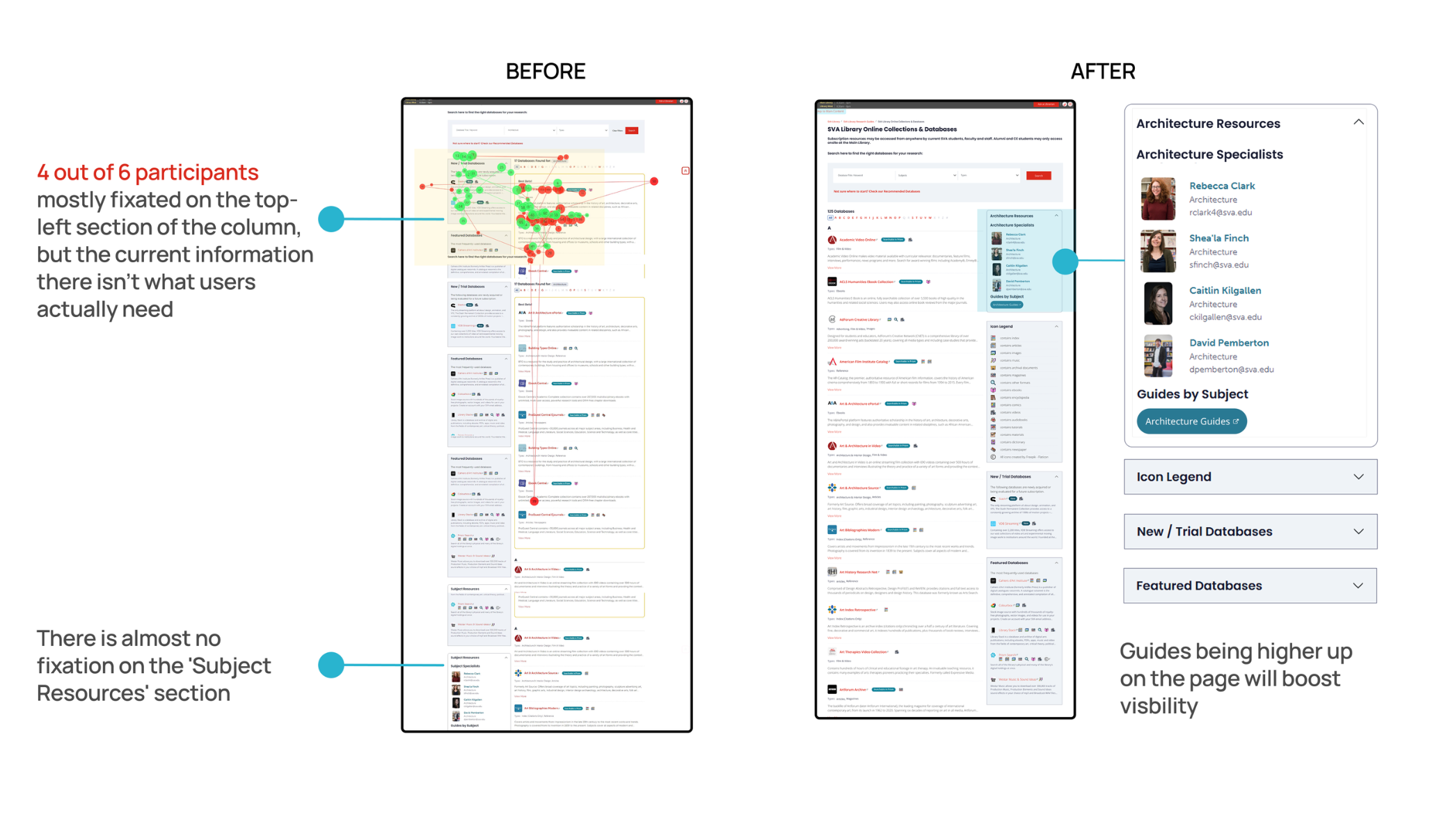
Swap the position of subject resources and New/Trial & Featured database
Swap the columns to the right side
Make the guide link a CTA button
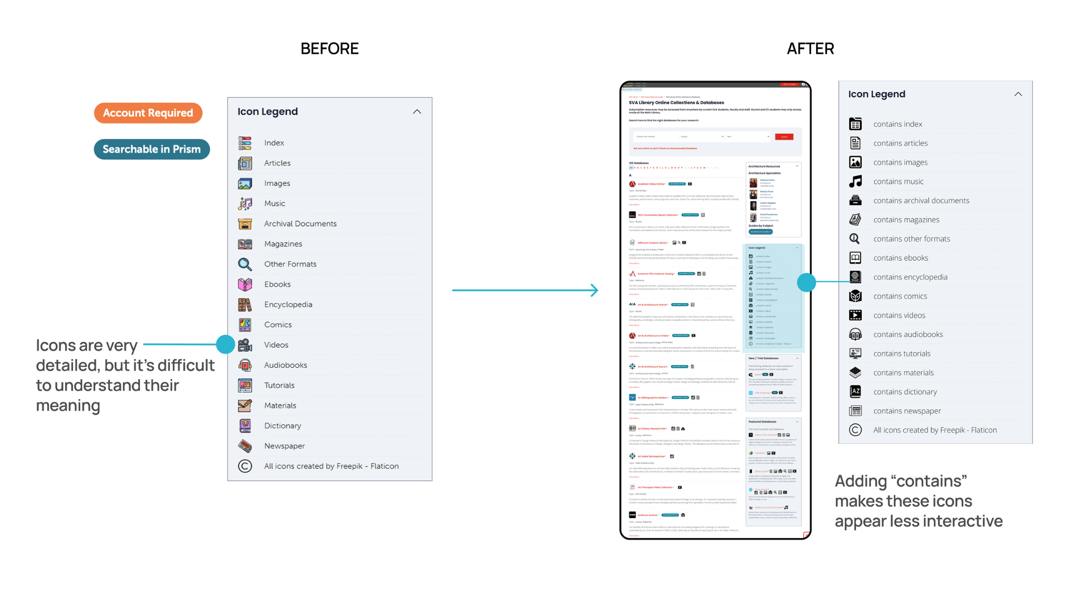
Finding 5:
100% of users think the Icons and labels lack clarity
44% of users thought icons were clickable and could be used as a "Type" filter
Recommendation 5:
Use a more standardized icon set that matches the user's prior experience, swap the columns to the right side
Change the icon label to more descriptive language, e.g., 'contains index.'
Want to see more?
For a more detailed view of the team’s findings, please see our findings highlight reel below, as well as our final presentation, which outlines our key findings and recommendations.
PRESENTATION & CONCLUSIONS
Client reactions & positive feedback
We presented to our client, Phoebe Stoneking, as well as other stakeholders in the SVA library, in an on-site in-person presentation format. We received very positive feedback from Phoebe, who detailed that she was impressed with our ability to create design recommendations that fit within the system constraints:
“Thank you so much for all of your hard work this semester. I thought you had really excellent recommendations regarding the icon set, improving the database search, and reorganizing the page content. You paid close attention to our system constraints, which is really appreciated.”
- Our Client
Reflections & Takeaways
I had some prior experience collecting eye-tracking data as an undergraduate research assistant, so I was excited to build on that knowledge in this project. This was my first time analyzing results from the Tobii eye tracker, and combining that with data analysis using the System Usability Scale (SUS) made for a valuable learning experience.
Here are some of the most important lessons I took away from the project, along with areas where I hope to continue improving.
How to be a Better Moderator: In this project, maintaining neutrality as a moderator was essential to reducing bias and collecting reliable data. I learned how to give more effective, non-leading feedback to participants by shifting from affirmations like “good” to open-ended prompts such as “okay, why do you think that?” This small but intentional change encouraged participants to elaborate on their thoughts and helped us gather richer, more insightful data as a result.
Consistent Communication Enhances Team Alignment: Timely communication, especially around scheduling and task delegation, played a critical role in keeping the team aligned.
Need for Better Personal Documentation Habits: While collaboration was strong, keeping up with post-testing documentation was a personal challenge. Setting reminders for data entry is a clear opportunity for improvement in future projects.